One bike courier for the three chores students actually outsource.
Vélo
2025
Product concept, UI design, brand identity
Solo
8,000Students on campus
30+Vendors already operating
100+Acres to cross
- Three logins, three carts and three waits collapse into one errand list
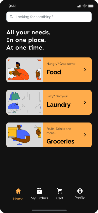
- Laundry moves from four taps deep inside a food app to equal billing on the home screen
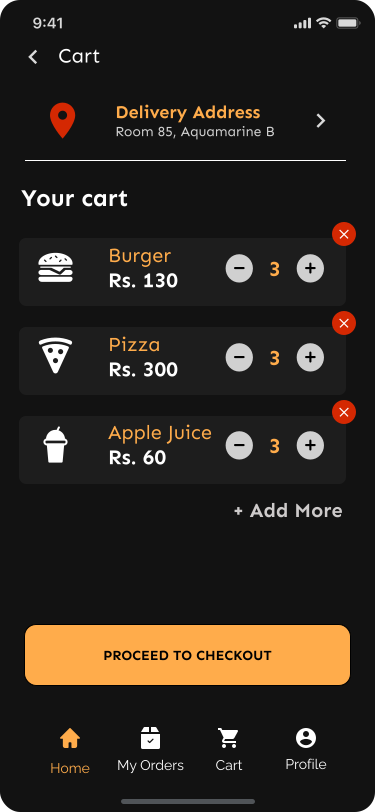
- Checkout asks only for the fields that decide the order, so the last screen stops being the one people abandon
- One layout skeleton across all three services, so learning to order dinner teaches you how to send laundry
This project started with a simple question: why do students need multiple apps to solve problems that happen in the same place?
Designing Vélo showed that the challenge wasn’t delivery logistics, it was reducing the number of decisions students make throughout the day. By bringing food, groceries and laundry into a single flow, the experience became less about choosing a service and more about getting a task done.
While the concept was never launched, it helped validate a direction I still believe in: for campus products, convenience comes from simplicity, not feature count.
A campus courier concept. Food, laundry and groceries all move around a hostel campus constantly, but nobody had built one service to carry all three. Vélo is a bet that a single courier, app and interface can replace the three entities that students juggle.
Hostel life means running three different delivery apps for three different errands, each with its own login and its own wait. Swiggy, Zomato and Blinkit are food apps at heart. Laundry, when it shows up at all, is an afterthought buried a few taps deep, not something the app was actually built around.
Students weren’t looking for another delivery app. They were looking for a single place to solve everyday hostel problems. Food ordering was already solved; the real friction came from constantly switching apps for everything else.
Opened all three apps side by side and watched exactly where each one breaks down the moment you stop ordering food: how deep the non-food categories get buried, how much friction shows up at checkout, how many taps it takes to find anything that isn’t a restaurant.
Open
A splash screen leads into a three-slide carousel built around q-commerce, convenience and couch-bound person. No feature tour, no permissions wall before you see what the app is actually for.
Choose a service
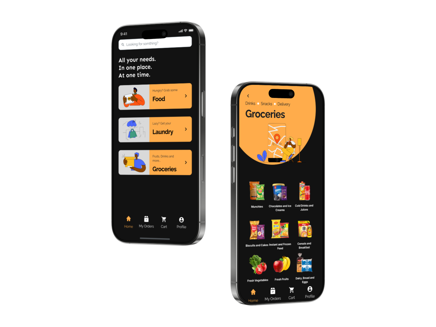
The design prioritizes tasks over categories, giving food, groceries and laundry equal prominence from the moment the app opens.
Build the order
Every category browse uses the same structure, so whatever gets learned ordering food carries straight over to ordering laundry.
Check out
The cart went through a second pass to strip it down to the fields that actually decide the order.
What I chose, what it cost, what changed.
Onboarding built around one specific person instead of a value proposition.
- “Fast and convenient” is the tagline on every delivery app that has ever shipped. A specific, couch-bound person who doesn’t want to leave the room is not.
- It’s aimed squarely at hostel life, which means it won’t travel well if Vélo ever tried to sell to a general audience.
- Three onboarding slides that read like a small story rather than a feature list.
One layout skeleton reused across all three category screens.
- Laundry is the unfamiliar service here. Giving it the same shape as food means whatever a user already learned ordering dinner transfers straight over.
- Laundry never really gets its own visual identity. It inherited food’s layout wholesale, quirks and all.
- Three services under one brand, and none of them feels like it arrived a version later.
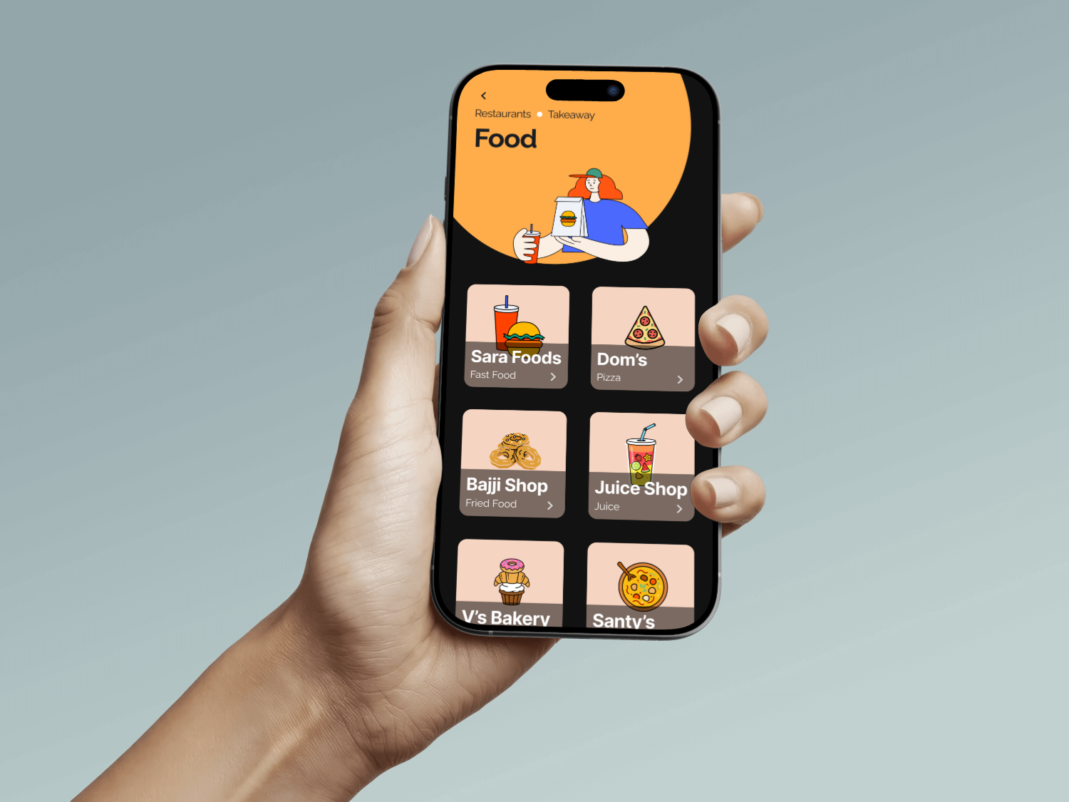
Kept the whole thing minimal, with just enough personality to stay fun.
- An errand app that looks too serious starts to feel like paperwork. One that looks too playful starts to feel unreliable with money.
- There is no single flashy screen here to put on a portfolio slide. The restraint itself is the whole move.
- A get-it-done app that people would still open on purpose.
Onboarding
A splash, a three-card carousel that narrates one couch-bound person, and a sign-up that gets out of the way.
01 / 07
Categories
One home screen, three services, and a browse view for each: food, groceries, and laundry share the same skeleton, so nothing feels bolted on.
01 / 04
Cart & Checkout
The cart got a second pass: a revamp that trimmed checkout down to the fields that actually decide the order.
01 / 04