Discover, book, pay, before the next class starts.
Festember App
2025
App UI: onboarding, discovery, ticketing, payments
Solo design. Built and published by DeltaForce.
18,000Footfall
1,000+Play Store installs
15LWorth of transactions processed
- Attendees bought and carried tickets on their phones instead of queueing at a desk on fest morning
- Eleven event clusters mirror how the fest is organised, so a four-day catalogue stays scannable in a corridor between classes
- Onboarding and event cards were built as a neutral frame the next year’s team reskins rather than redesigns
- Nothing in the product asks anyone to learn a new interaction on the one morning nobody has time to learn one
Built and published by DeltaForce, NIT Trichy’s student dev team, from these designs. Every number above comes straight off the public listing. Tap through and check it for yourself.
Festember is NIT Trichy’s annual cultural festival, one of South India’s largest student-run events. Th
The app needs to let people discover events, navigate a genuinely chaotic four-day fest, buy tickets, and pay, without any of it breaking.
The real product wasn’t this year’s app. It was a framework that could survive next year’s theme, next year’s team, and next year’s deadlines without needing to be redesigned from scratch.
Looked at how event apps operating at real scale (Insider, BookMyShow, District) structure the path from discovery to a bought ticket, and specifically where each one loses people somewhere between browsing and buying.
Get in
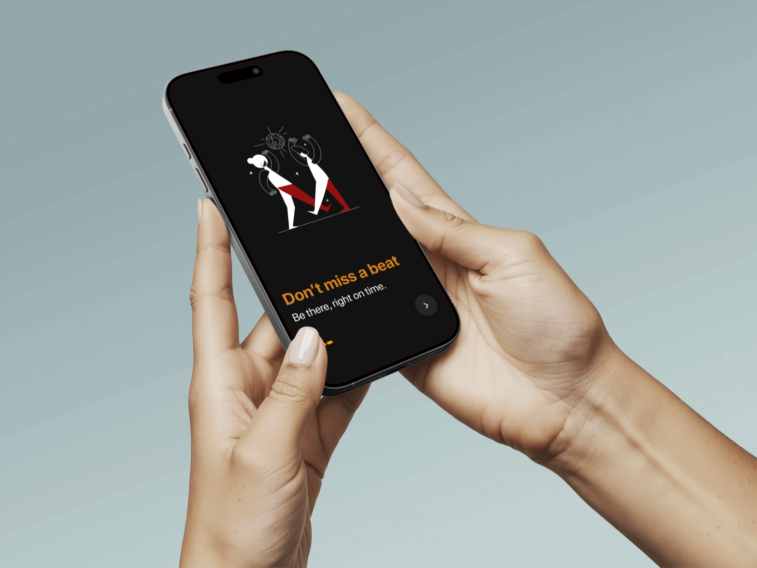
Start screen, themed carousel, sign-in, sign-up: A clean, simple onboarding so users know what to expect.
Find something
Home, search, ticketing, and event clusters, laid out the way the fest is actually organised.
Choose
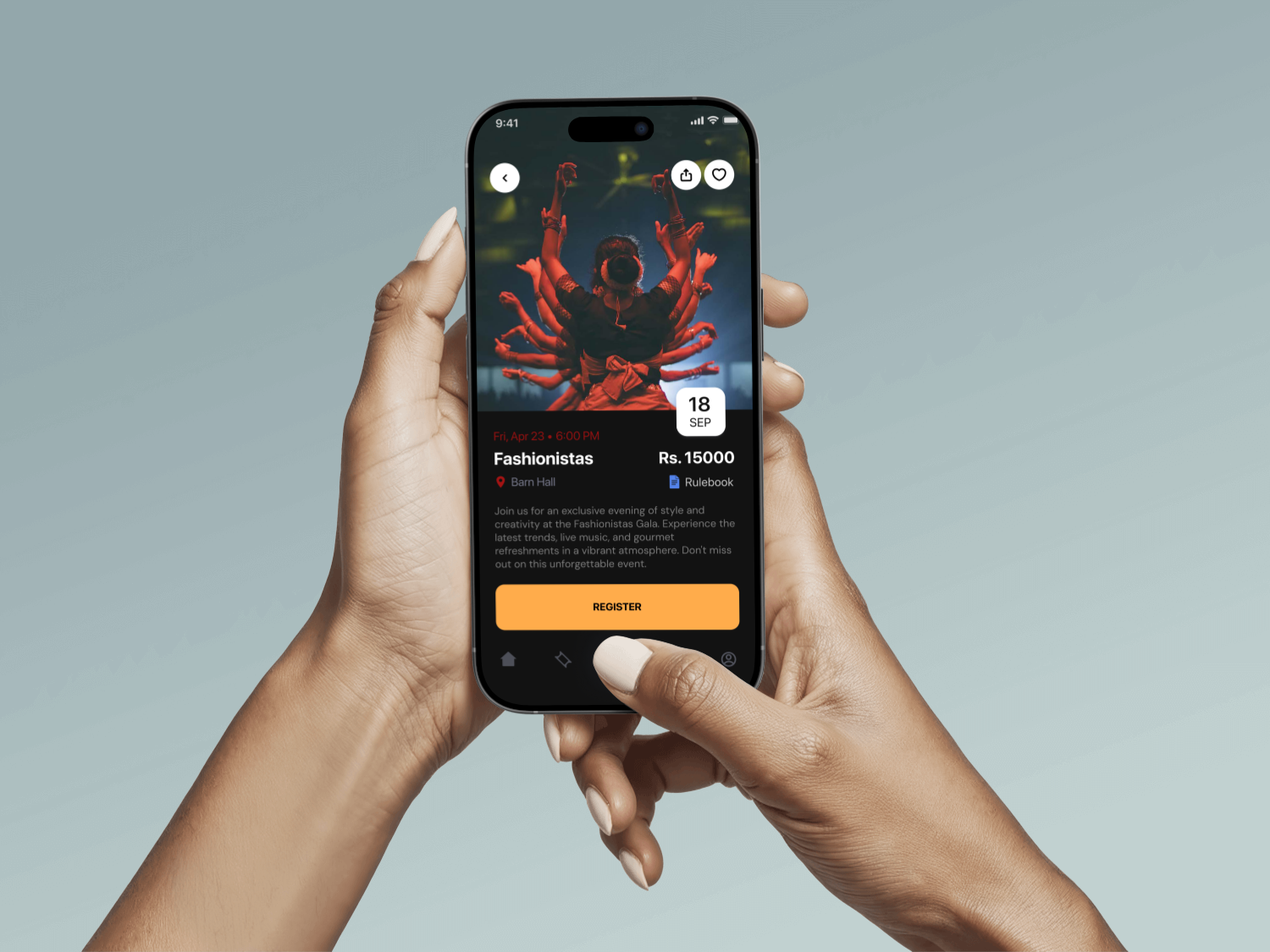
Event cards prioritise the details people look for first—what it is, when it starts, and where it happens—so choosing what to attend takes seconds, not minutes.
Pay and keep the record
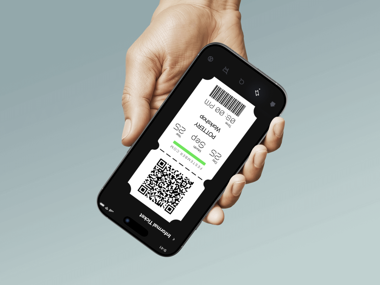
Ticket, transaction, confirmation: the part that simply has to hold up on fest morning with the network under load and everyone opening the app at once.
What I chose, what it cost, what changed.
A simple, clean, premium and neutral shell built to outlast every year’s theme.
- Festember rebuilds its visual identity from scratch each year. A product designed around one year’s look becomes a rewrite the moment that look changes.
- It never gets to be this year’s showpiece. That role belongs to the marketing site, not the app.
- Bold and current enough to feel part of the event, plain enough underneath to be re-skinned instead of rebuilt.
Discovery, ticketing and payment all inside one app, not spread across three destinations.
- Fest-goers decide and buy in the same five minutes between classes. Handing them off to a separate web checkout is exactly where you lose them.
- Building payments into the app is a much heavier lift than linking out to an existing ticketing site.
- One continuous flow from “what’s on” to “I’m going,” with nothing left to go re-find later.
Familiar navigation, ticketing and payment patterns, end to end.
- Nobody has time to build muscle memory for it, so it has to run on muscle memory borrowed from everything else.
- There’s no novel interaction anywhere in the product. That was the point, not an oversight.
- Nothing new to learn on the one morning nobody has time to learn anything new.
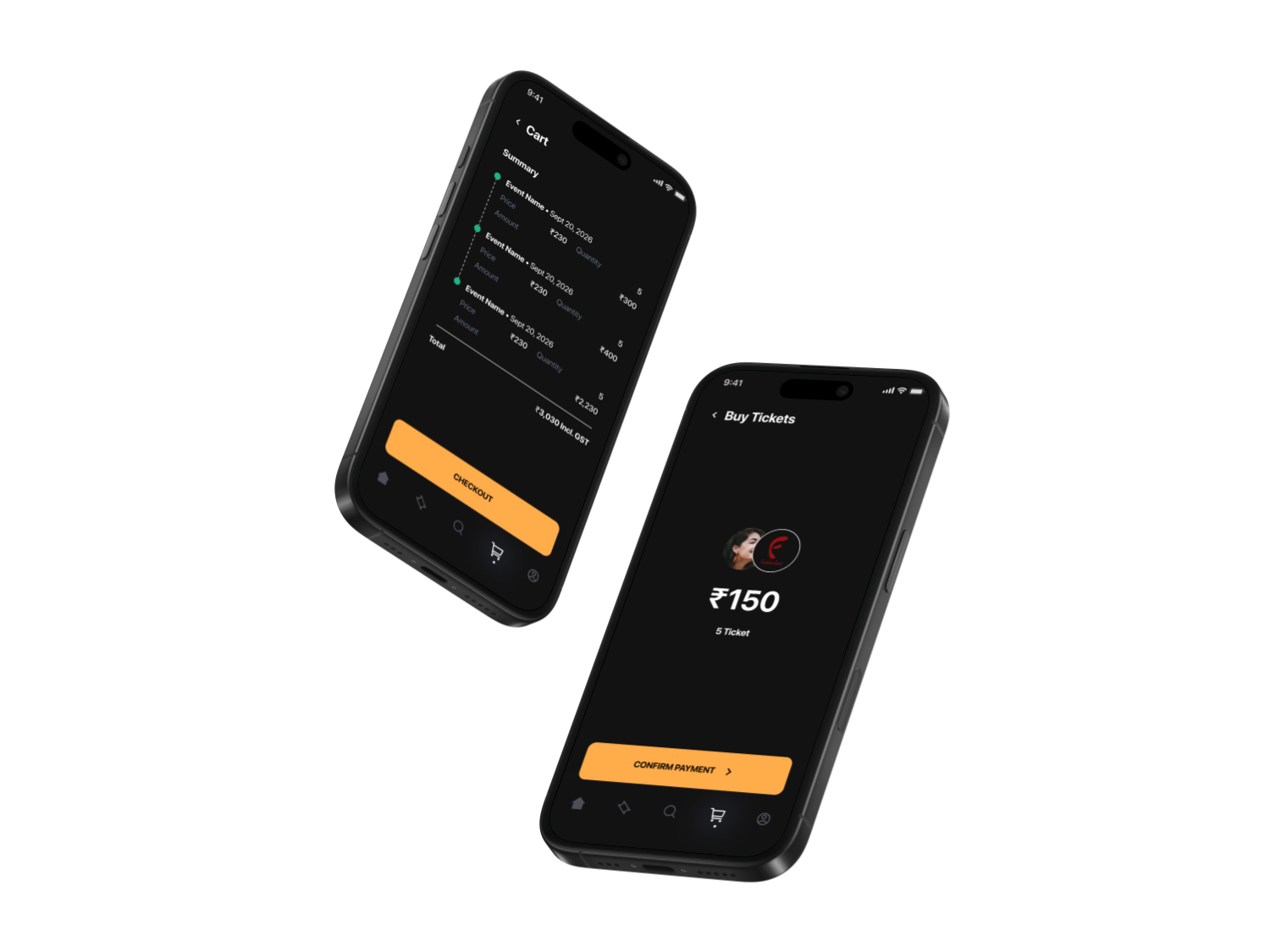
Onboarding
Start, a themed carousel, sign-in and sign-up: the neutral, reusable entry that every year’s attendees pass through.
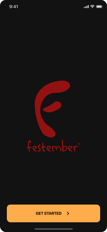
01 / 08
Discover
Home, search, and the 11 event clusters: the whole fest laid out the way it is actually organised.
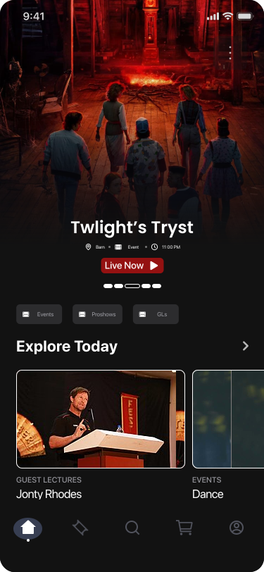
01 / 04
Event
A real listing, Fashionistas Gala, real date and venue, because the app had to work with real event data from day one.
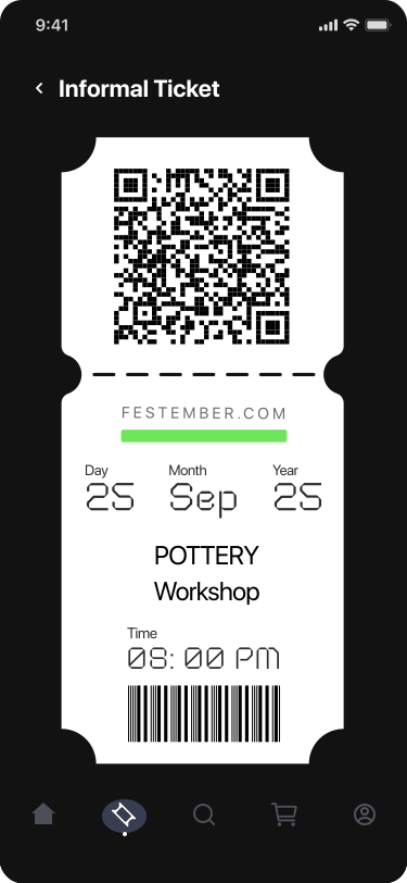
01 / 02
Payments
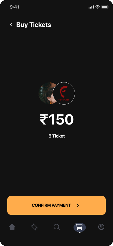
Buy the ticket, confirm the transaction, keep the record: the part that simply has to work on fest morning.
01 / 03