They buried their best reason to enrol three scrolls down. I moved it.
TuteDude
2025
Full redesign: landing page and value section
Solo, unsolicited
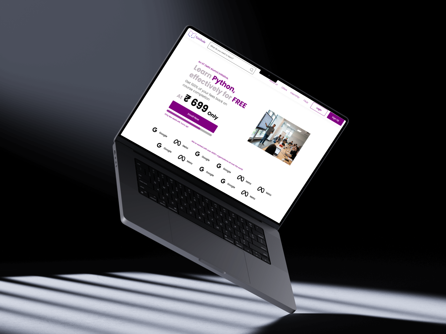
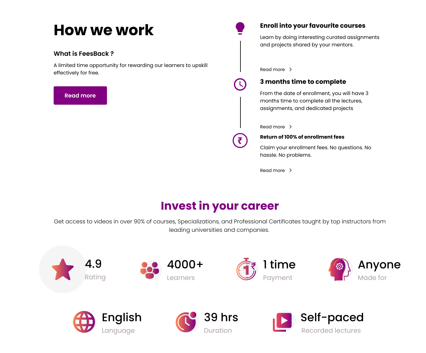
- The refund promise moves from the third screenful into the hero, where a buyer makes the decision
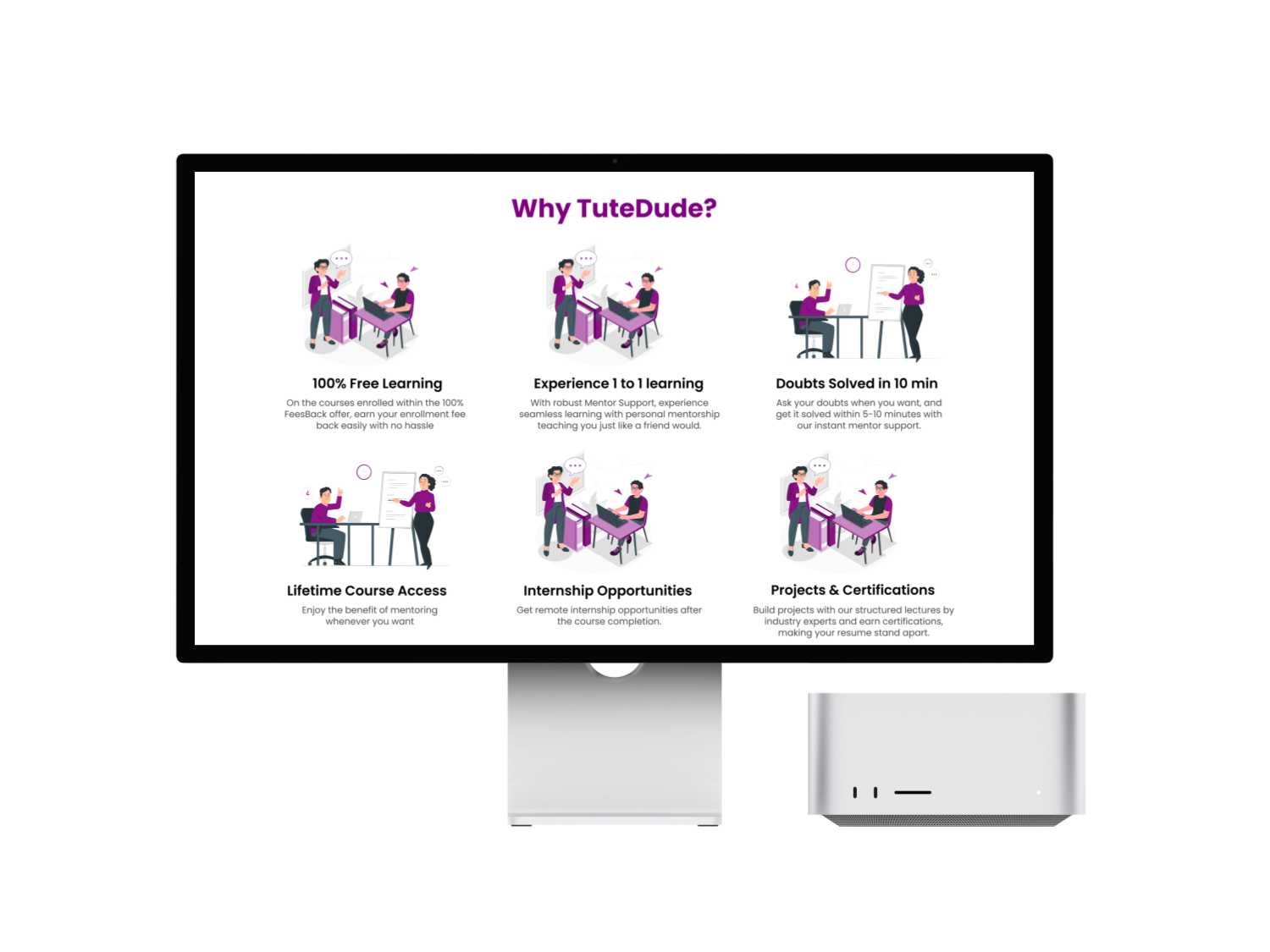
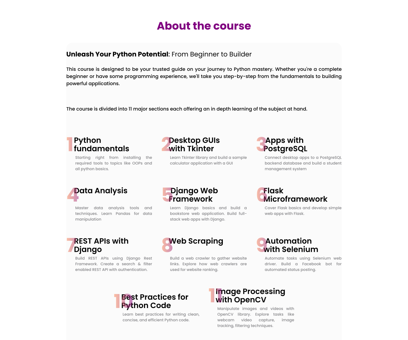
- Curriculum and offer read as infographics instead of body copy, so someone can skim the whole pitch in one pass
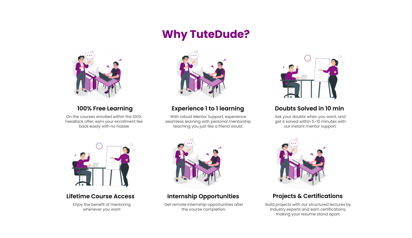
- Four promises replace a wall of features, which is what a page gets read as when it gets skimmed
- Enrol-CTA click-through rate
- Scroll depth to the CTA, which should drop now that the CTA moved up
- Bounce rate on the landing page
- Time-to-decision: how fast a visitor actually reaches the enrol click
There’s no A/B test behind this. TuteDude never commissioned it and never shipped it. The before/after above is the entire argument, and it either holds up on sight or it doesn’t.
TuteDude is a real ed-tech company: a large learner base, a strong rating, a founding team out of IIT Delhi, all sitting behind a home page that buries the single best reason to sign up. Nobody at TuteDude asked me to fix it. I did it anyway, because the fix seemed obvious the moment I saw the page.
The live page opens with course details and only gets to its strongest trust signal, a full fee refund on completion, several scrolls later. Anyone who bounces in the first ten seconds, which is most people, never sees the one thing that actually kills their biggest objection to signing up.
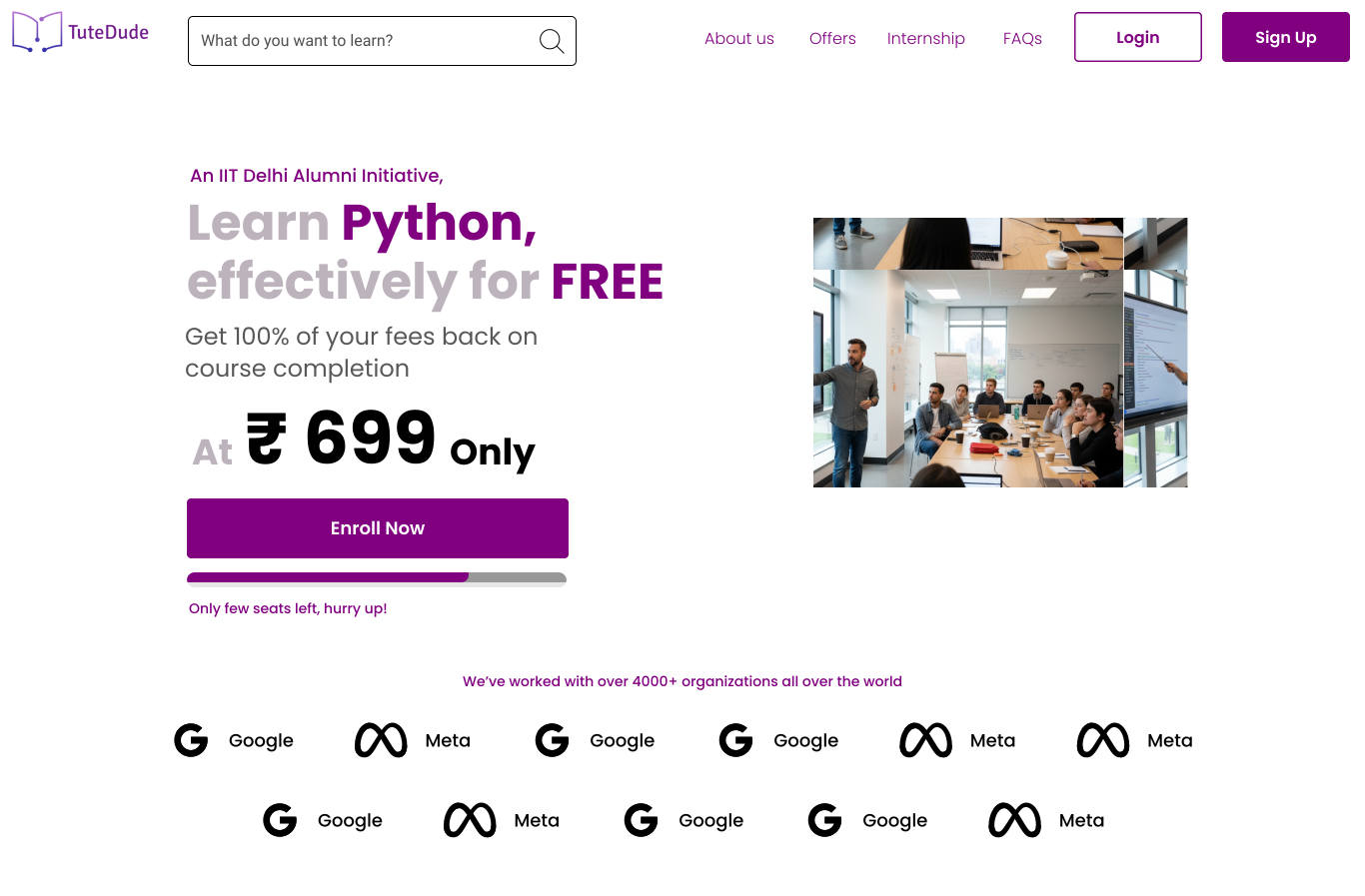
Nobody at TuteDude asked for this. Their refund offer was sitting three scrolls down doing nothing, so I moved it to the top and wrote up the redesign as a case study.
Looked at how Coursera, Udemy, BYJU’S and Aakash each handle pricing anxiety and urgency specifically, because that’s the exact moment TuteDude’s own page was clearly losing people.
Land on the claim
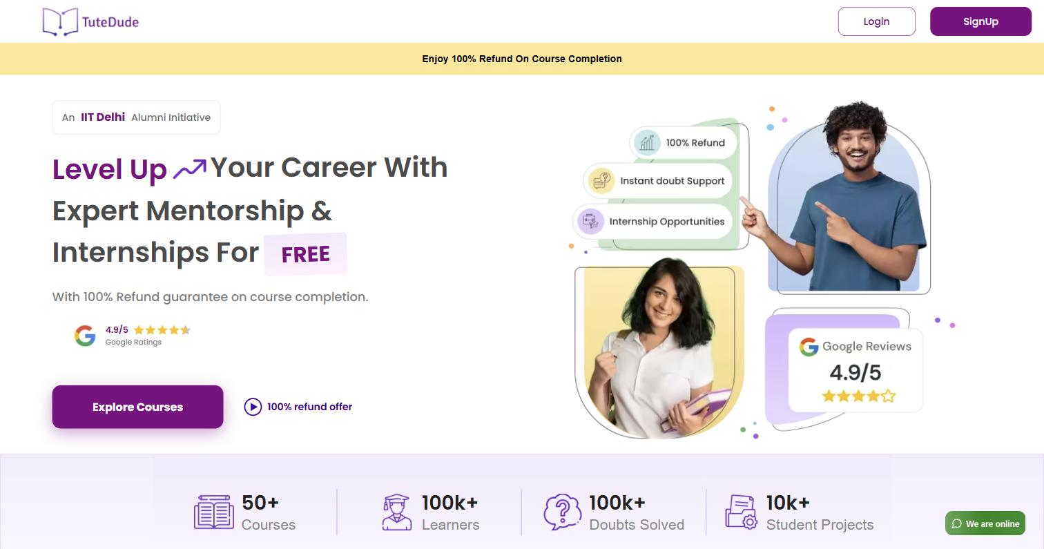
The refund offer is the headline now, not a footnote. The biggest objection to signing up dies in the first screen instead of the fourth.
Scan four promises
Free on completion, 1-on-1 mentors, doubts answered in ten minutes, lifetime access: four short lines, not one paragraph nobody finishes.
Check the substance
Curriculum and mentor support are drawn as infographics, so the structure of the offer explains itself faster than a paragraph ever could.
Answer the last doubt
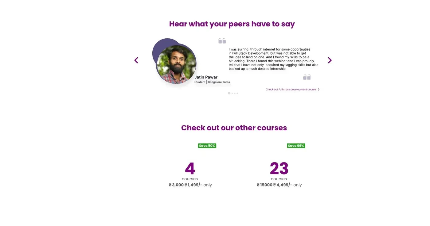
Testimonials, resources, then FAQs, roughly in the order a hesitant buyer actually reaches for them before finally committing.
What I chose, what it cost, what changed.
Made the refund offer the hero headline.
- It’s the strongest objection-killer anywhere on the page. The best real estate should go to the strongest claim, not whatever claim came first in the original layout.
- Course specifics get pushed below the fold, so a curriculum-first buyer now has to scroll to find them.
- The reason to trust TuteDude shows up before the reason to hesitate does.
Went with honest urgency, “only a few seats left,” instead of a countdown timer.
- A countdown that resets on refresh teaches a visitor that nothing on the page is actually true. That’s an expensive lesson to teach right before asking for money.
- A real countdown almost certainly moves more clicks in the short run. This trades some of that for not lying.
- Urgency the page can actually stand behind if someone checks.
Split the value proposition into four short, scannable promises.
- Free-on-completion, 1-on-1 mentors, doubts solved in ten minutes, lifetime access: four separate claims, none of which survive being folded into one paragraph.
- Each promise gets a single line, which means none of them get the fuller explanation a couple probably deserve.
- A value section built to survive being skimmed, since skimming is how it’s actually going to get read.
Replaced most of the body copy with infographics and illustration.
- The offer and the curriculum are both fundamentally structural. Structure reads faster drawn than it does written out in sentences.
- Every section now needs custom artwork before it can ship, instead of just a paragraph someone can drop in.
- A page that reads faster and, frankly, looks like a company worth handing your money to.
Redesigned Landing
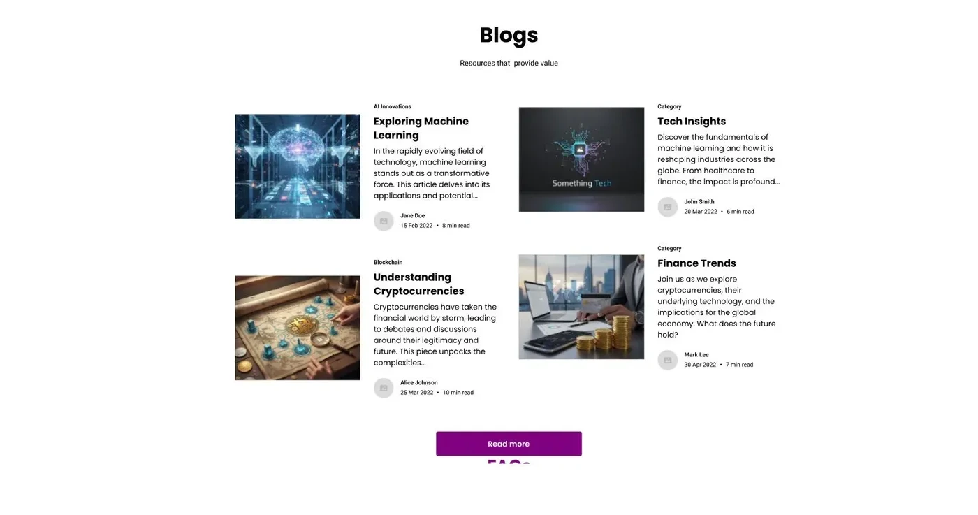
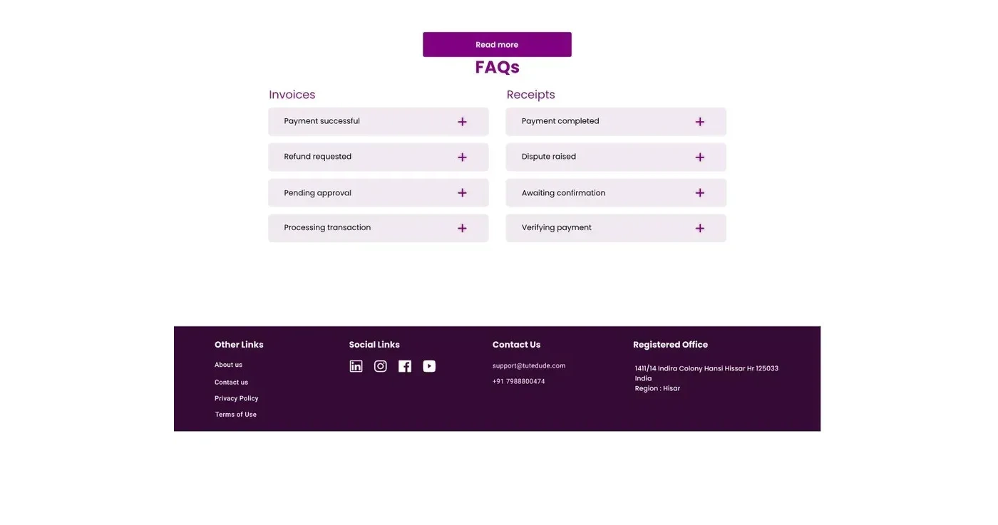
The full page, top to bottom: refund offer in the hero, four promises, honest urgency, real course facts.
tutedude.com/category/python
01 / 07