The pitch for a fest site sponsors would take seriously.
Cyberscape
2025
Landing, event clusters, event catalogue
Solo
- A student-run fest reads as a technology event, which is what its sponsors and its outside entrants are being sold
- Clusters keep a catalogue this large navigable, so the cinematic treatment never costs anyone the event they came for
- Time spent on the Clusters and Events pages, as a rough proxy for whether the theme holds attention or just gets in the way
- Sponsor-page click-through from the hero
- Catalogue search-to-event-page rate
Cyberscape exists to make an argument, not to ship: that a student-run fest running events open to the world can justify looking this serious, and that going fully cinematic doesn’t have to break a catalogue this large underneath it.
A concept for the web face of Pragyan, NIT Trichy’s international techno-managerial fest and one of India’s largest student-run events. It never got built. This is the version I put together to make the case for what it could be.
Pragyan pulls in sponsors and workshop-goers actively deciding whether the event is worth their company’s name on a banner. A typical cultural-fest look undersells that entirely, but underneath whatever mood the site sets, a genuinely large event catalogue still has to stay easy to navigate.
I wanted Cyberscape to feel serious, even a little unsettling, and I meant that. Sponsors and industry judges show up to this fest alongside the usual campus crowd, so playing it safe and friendly felt like the wrong call.
Skipped the usual design references for this one and looked at cyberpunk and gaming-event sites instead, trying to find how far “dangerous” a college fest site can go before it stops being legible to a sponsor skimming it on their phone.
Landing
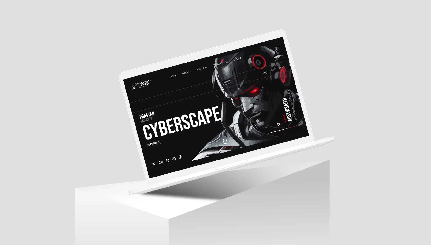
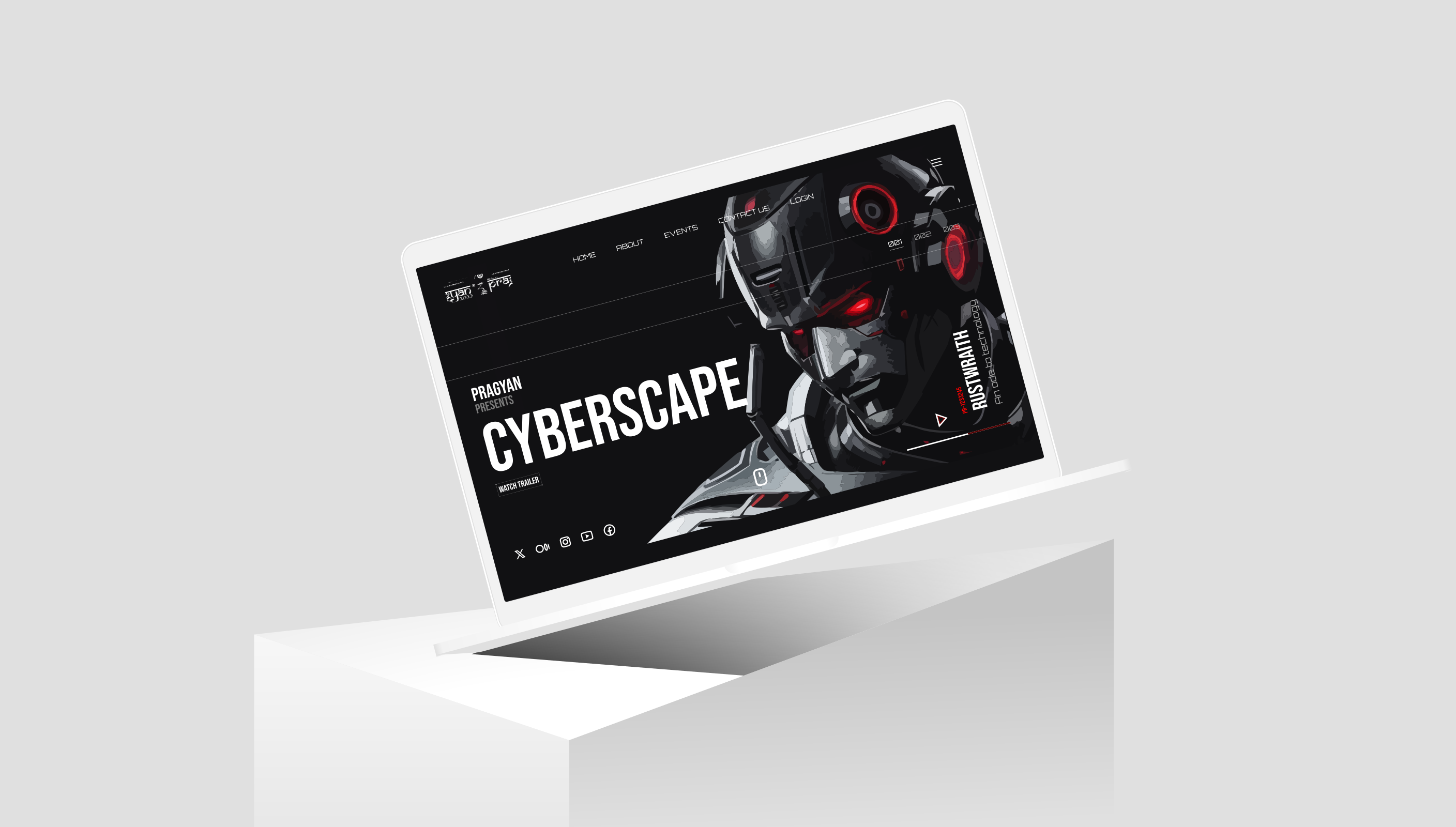
A cyborg hero under red accent lighting states the fest’s ambition before a single event gets named.
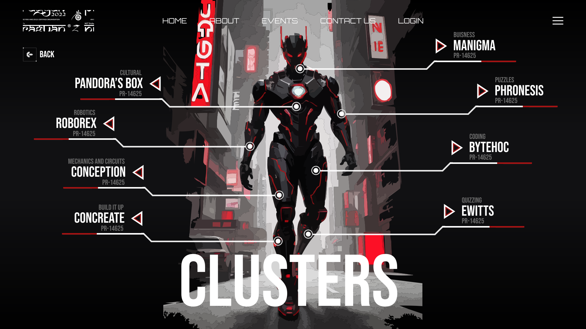
Clusters
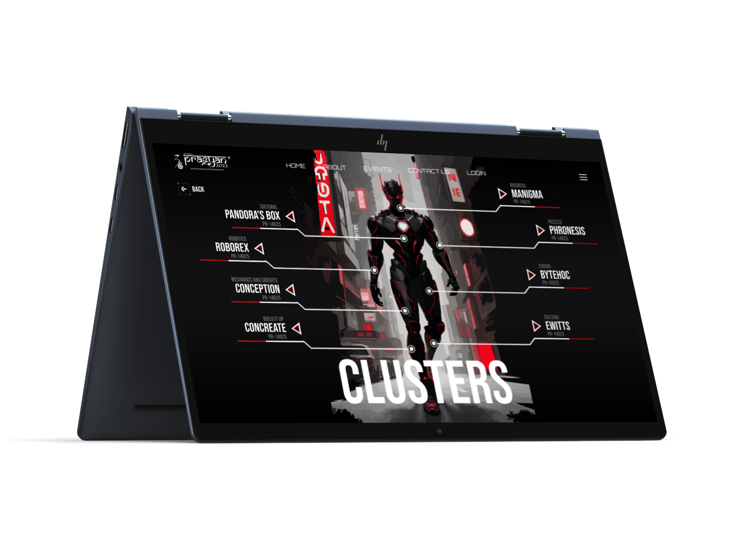
Event clusters act as the organising spine, the one structural idea holding a genuinely huge catalogue together.
Catalogue
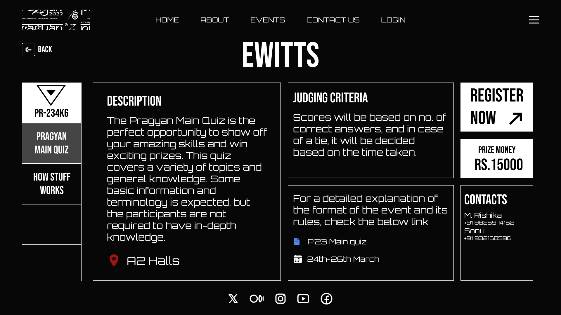
Individual events are scannable at a glance, with dates and tracks readable without needing a click.
What I chose, what it cost, what changed.
A cyborg hero illustration lit in red, set against near-black.
- Sponsors decide in the first screen whether they’re looking at a student project or a real event. Cinematic gets there faster than a photo of the campus ever could.
- None of this reads as welcoming. A nervous first-year visitor would feel that immediately.
- A fest site that reads like a technology event rather than a college function.
Numbered nav ticks, 001, 002, 003, instead of plain text links.
- A small detail borrowed from sci-fi interface design that makes even a basic menu feel like it belongs in the same universe as everything else, at almost no cost.
- A number is a weaker label than a word if someone’s specifically hunting for one page.
- The theme carries through into the navigation instead of stopping at the hero.
Gave the hero an artist/DJ-style credit line.
- A lineup announcement should read like an event poster, not a printed schedule. That credit line is the entire difference between the two.
- It costs a little clarity about what’s actually being announced, at first glance.
- The landing page sells the fest before it ever gets around to informing you about it.
Landing
The sci-fi hero: the fest’s ambition stated before a single event is named.
pragyan.org
Clusters
Event clusters as the organising spine, keeping a huge catalogue navigable.
pragyan.org/clusters
Events
The catalogue: individual events scannable at a glance, dates and tracks without a click.
pragyan.org/events