A landing page that sounds like it manages a pension fund, not a growth stage startup.
Apex
2024
Landing page concept, B2B positioning
Solo
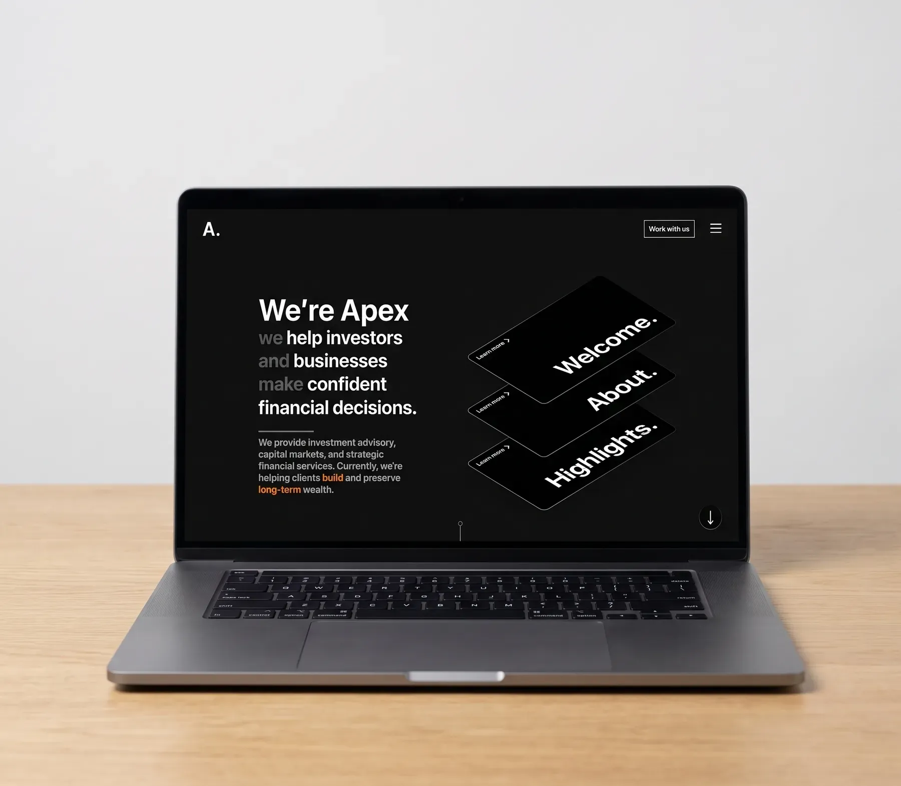
- A CFO reads a point of view before they read a feature list, which is the order that sells an advisor
- One visual flourish in the whole page, so the restraint reads as considered rather than unfinished
- Consultation-request rate from the hero, compared against requests from further down the page
- Qualified-lead share: how many enquiries actually came from the buyer this page is aimed at
- Scroll depth past the copy-led hero
Apex exists mostly to prove range: that I can put the consumer polish down and design something that behaves like it manages serious institutional money. It’s a tone exercise, and the tone is the whole deliverable.
A concept landing page for an investment advisory firm: capital markets, wealth management, the kind of client whose day job is being someone’s CFO. Not every project on here needs to sound like it’s talking to a 22-year-old, and this one was a chance to prove that to myself as much as to anyone reviewing it.
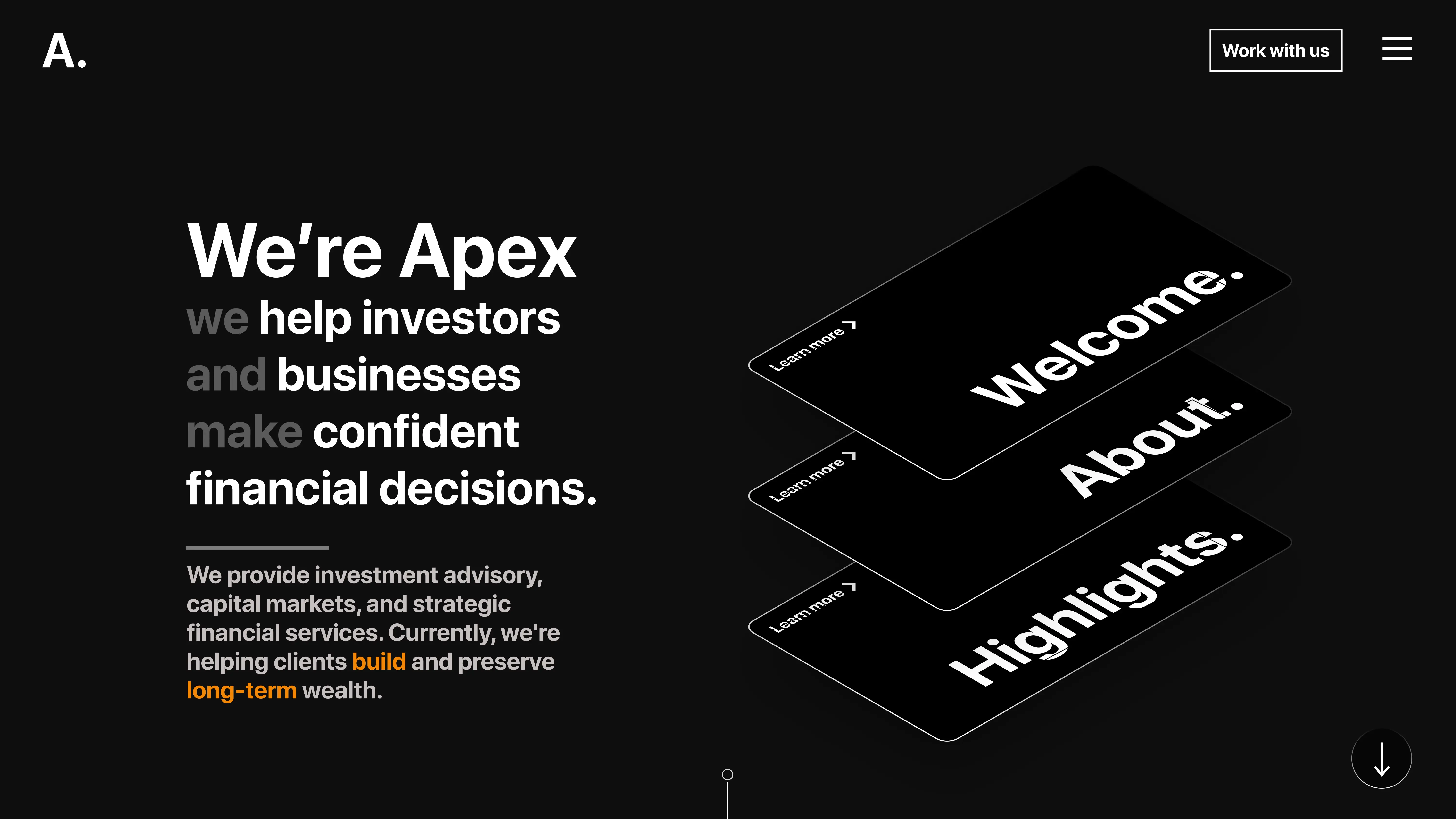
Advisory clients aren’t shopping for delight. They’re shopping for calm authority. A wealth-management page that looks like a consumer app quietly undercuts the exact thing it’s trying to sell: the sense that these people are careful with your money.
I deliberately stripped out the consumer polish here. No dashboard chrome up front, almost no colour, just enough copy and a single isometric card stack to sound like a firm that manages a pension fund.
Looked at institutional finance sites built for board members rather than retail traders, and paid attention to how they lean on restraint and typography instead of charts and colour to do the work of signaling seriousness.
Open on a claim
Copy leads, not a product screenshot. The words have to do the convincing before any interface is allowed on screen.
Prove it quietly
The highlights section carries the same low-volume tone rather than switching into a harder sell partway down the page.
Close without a pitch
The footer ends the page the same way the hero opened it. No urgency banner, nothing chasing you toward a button.
What I chose, what it cost, what changed.
Led with copy. No product screenshot above the fold.
- The words need to do the convincing before any interface shows up. A screenshot invites someone to evaluate the software; copy invites them to evaluate the firm behind it.
- A visitor leaves the hero with genuinely no idea what the product looks like.
- The first impression is a point of view, not a feature list.
Near-black background, restrained white type, no dashboard chrome anywhere.
- Data density reads as “tool.” Space reads as “advisor.” This page is selling the advisor, not the tool.
- Very little actual information gets communicated per scroll, compared to a normal SaaS landing page.
- Trust and authority land before any specific capability claim gets made.
Allowed exactly one visual flourish: an isometric card stack.
- Push restraint far enough and it tips into blankness. There needs to be one thing worth looking at. One is enough; two would have started turning into a style.
- The rest of the page stays deliberately quiet, with nothing else to hold visual interest.
- A page that reads as considered rather than simply unfinished.
Landing
The single hero and the sections beneath it: institutional tone, credibility first, product second.
apex.capital
01 / 03