A marketing site built to look incredible for one year, then disappear entirely.
Festember Website
2025
Web design, Art direction
Solo
3,000+Registrations driven
Livefestember.com
1 yearDesigned shelf life
- A student checking event timings from a phone between classes gets the layout that was designed first, not a folded-down desktop one
- The theme lands before the schedule does, which is what a fest site is selling in its first eight seconds
- Registration stayed two scrolls from a hero that names no events, and still carried 3,000+ sign-ups
- Next year’s team inherits no visual debt, because nothing here was built to be reused
The noir hero and About section were designed for one year, not for longevity. Next year gets its own visual language from scratch, and that’s a feature of how this project works, not a shortcoming of this one.
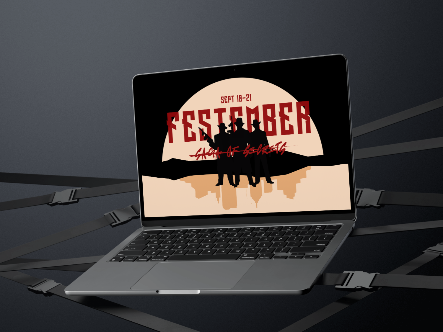
The official website for NIT Trichy’s annual cultural festival. Its only real job is convincing someone this year’s theme, “Saga of Secrets,” is worth showing up for.
A fest site that looks like last year’s hasn’t done its job. This one needed to carry a genuinely noir theme without sliding into melodrama, while still working as the place someone checks their event timings from a phone between two classes.
This whole identity gets exactly one year on the internet before it’s replaced. I designed it knowing that going in, which changes what you’re even optimising for.
Skipped the usual Dribbble-and-Behance research pass for this one, since the theme called for a different reference set entirely. Looked at GTA V, Assassin’s Creed, and TV title sequences that already knew how to build this exact mood in about eight seconds.
Arrive on the theme
The noir hero states “Saga of Secrets” before a single event is named. Mood arrives first, the schedule second.
Meet the fest
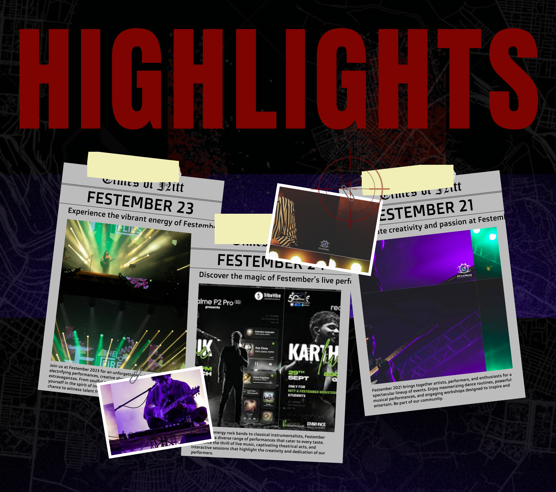
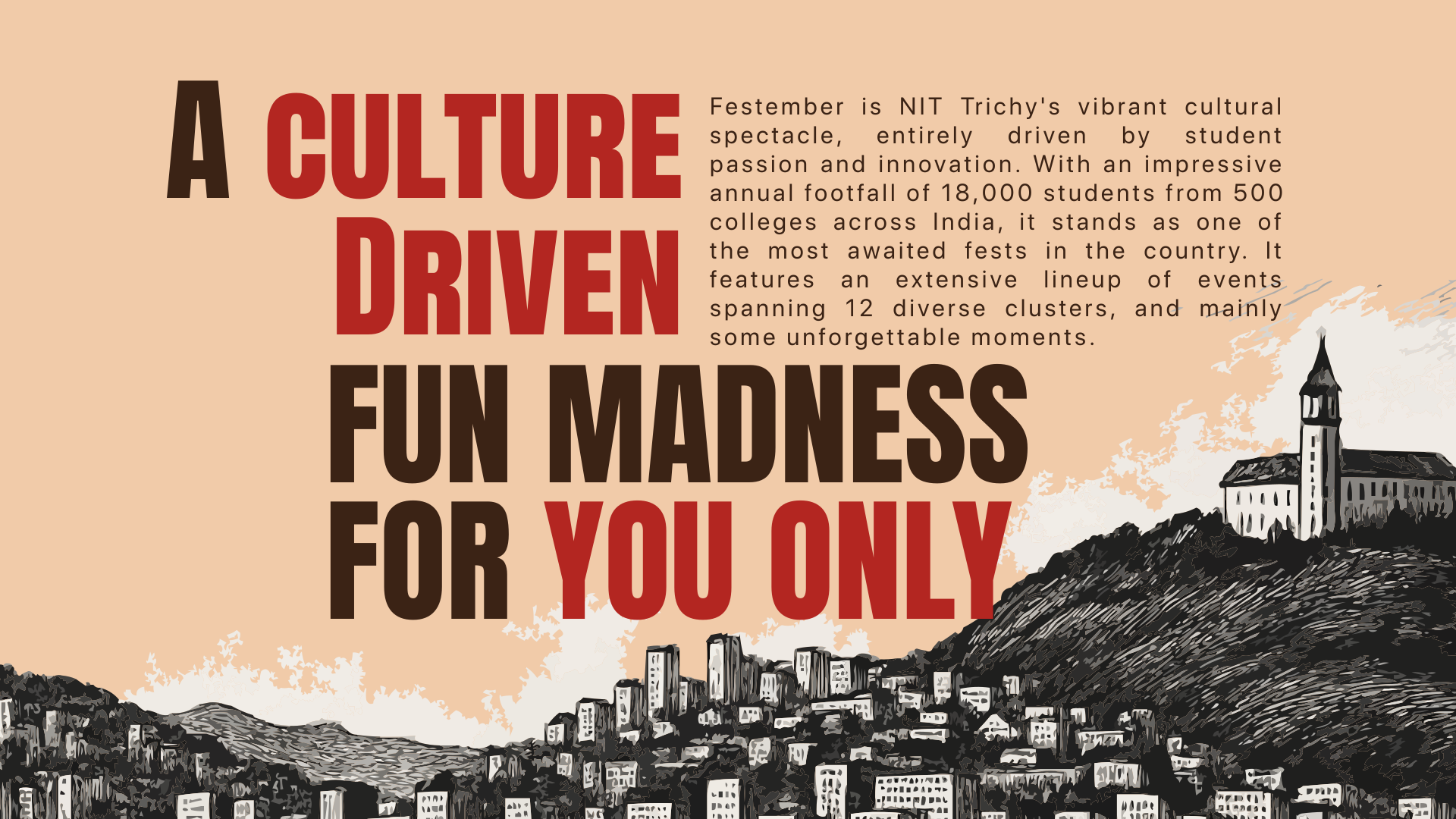
About and last year’s highlights build the story behind Festember, giving the theme a past worth discovering.
Enter the fest
Events, registration, sponsors and essential details sit inside a visual system designed to make every interaction feel considered.
Carry it forward
From the first scroll to the final registration, every detail builds a digital identity that feels as memorable as the fest itself.
What I chose, what it cost, what changed.
A noir, silhouette-driven aesthetic built for exactly one edition.
- “Saga of Secrets” only works if the site withholds as much as it shows. Silhouettes are built to withhold.
- None of it is meant to survive into next year’s theme. That was true before a single pixel got drawn.
- A marketing face nobody would confuse with last year’s fest.
Minimalism over spectacle, even with a genuinely dramatic theme in hand.
- A theme this loaded turns melodramatic fast if you crowd it. Space around it gives someone a moment to actually sit with the idea instead of scrolling past it.
- Fewer things fit on screen, which means fewer chances to push a specific event above the fold.
- A hero that holds attention long enough for the theme to land before the schedule takes over.
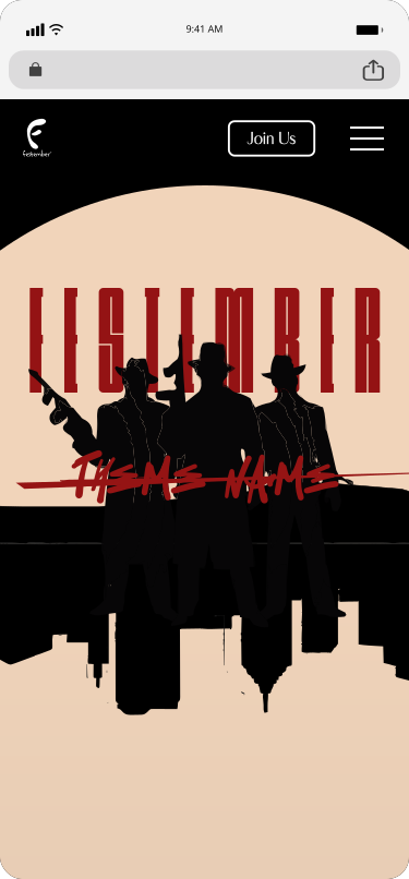
Treated the mobile layout as the primary case, not a fallback of the desktop one.
- Most people hitting this site are a student checking event timings on their phone, not someone admiring a desktop hero on a laptop.
- The mobile pass ended up taking about as long as the desktop one. It wasn’t a quick resize job.
- The same theme, folded down to a phone screen without losing the mood that justified building it in the first place.
Desktop
The full-size noir hero and the About section: the silhouette treatment given the real estate it was built for.
localhost:3000
01 / 02
Mobile
The same theme folded down to a phone, where most students actually open a fest site from.
01 / 03