A trading app for people betting on events, not stock prices.
TradeView
2025
Landing page, dashboard, prediction flow
Solo
- Odds arrive as a price a newcomer already knows how to compare, with no percentage to convert in their head
- Settlement rules sit on the event page itself, so trust shows up at the same moment the money decision does
- Time from landing on an event page to placing a first position
- Share of first-time users who open the Rules Summary before trading
- Drop-off between viewing an event and actually committing to a side
- Repeat participation across unrelated event categories
“Trading app” might be the single most crowded category in every design portfolio on the internet, mine included until recently. TradeView earns its spot here mostly because it isn’t really a trading app. It’s a prediction market built around whether something happens, not what a stock is worth.
The question this product is actually built around isn’t “what is this stock worth,” or “will this specific thing happen?”. The goal was to make something fun and engaging look premium and elegant while making that mechanic click for a first-time visitor in one glance, with no tutorial and no mental math required, turned out to be the entire design job.
Almost every screen in this app looks like a normal trading app, because most trading apps genuinely do the same three things. The one screen I’d actually defend in a design review is the prediction event page.
Looked at Polymarket and Kalshi for how prediction markets frame odds in a way a total newcomer can actually parse, then looked at Zerodha and Groww to find the exact gap between trading a stock and betting on an event.
Land
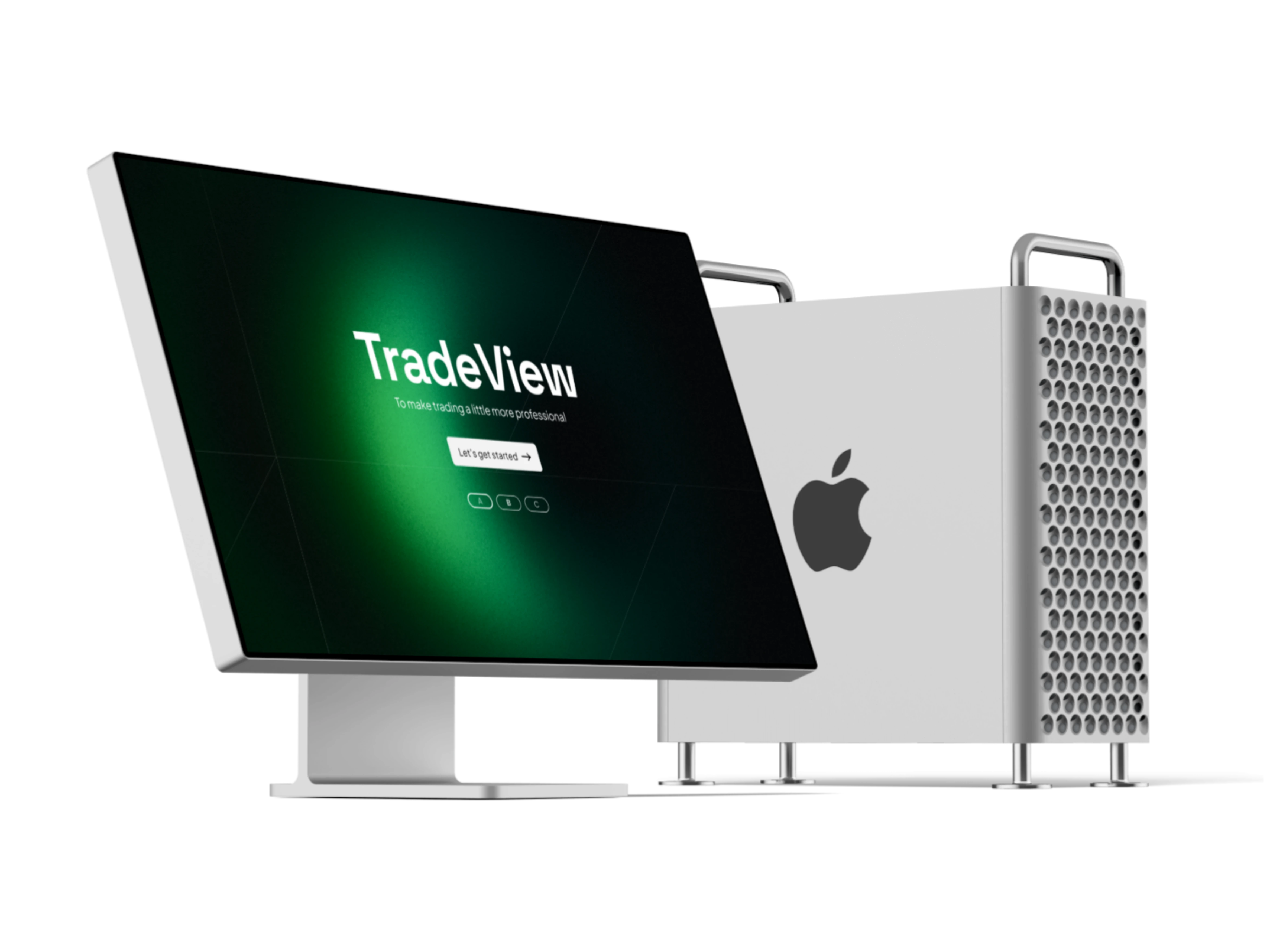
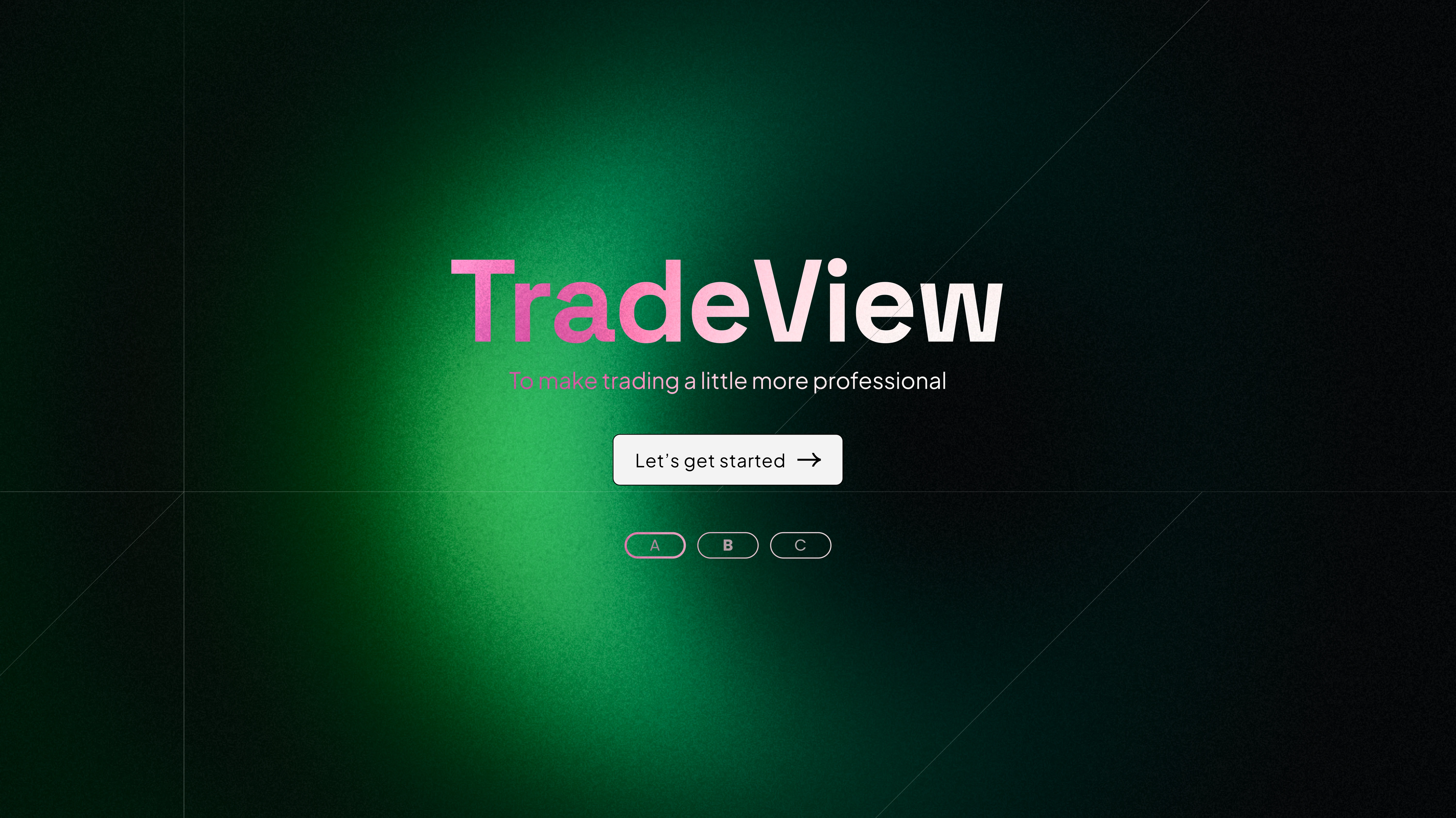
A single green radial glow on black establishes serious-fintech credibility before a single chart has loaded.
Dashboard
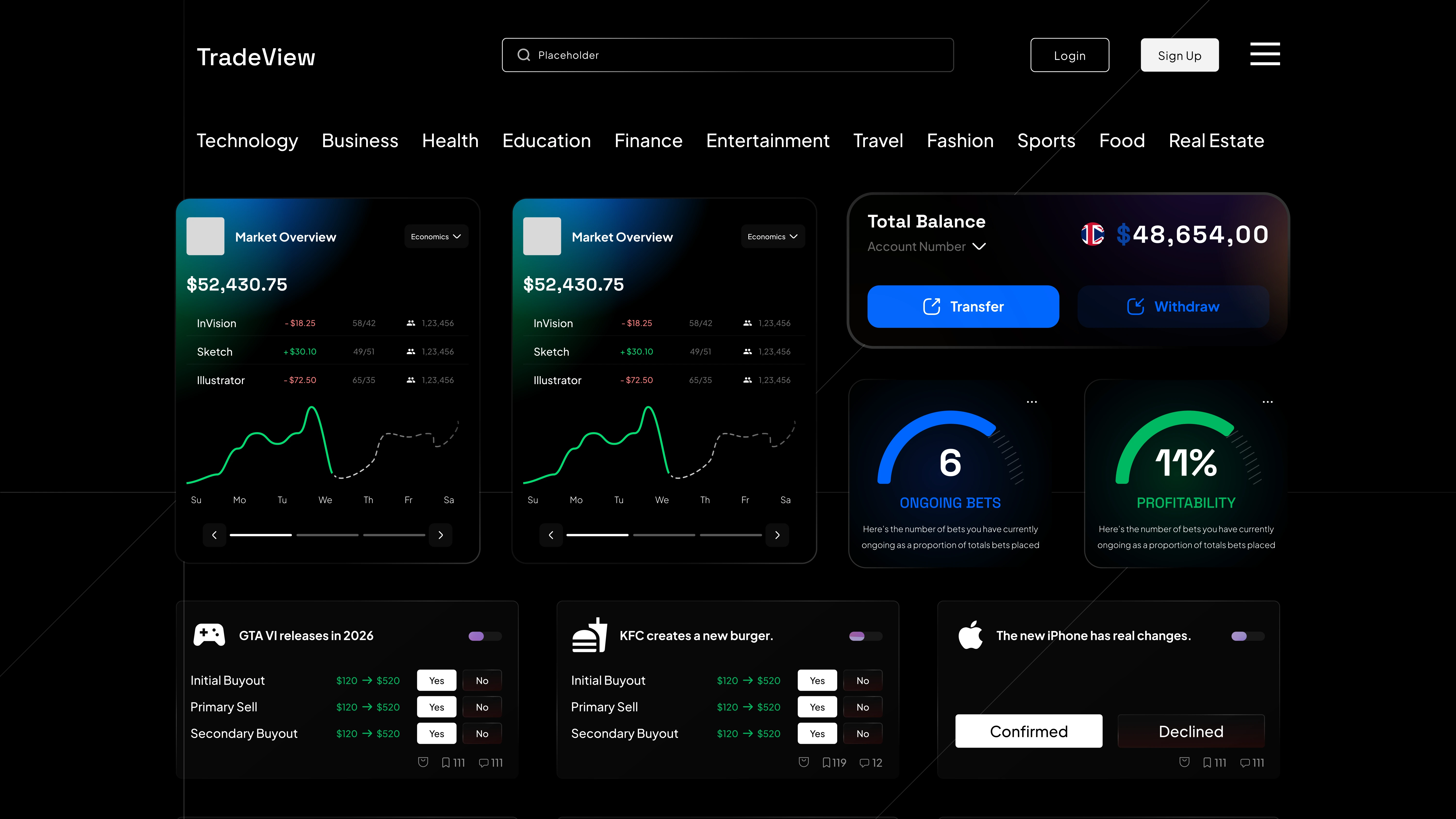
Balances, activity, and a route back into every open position: the most conventional screen in the whole product, on purpose.
Prediction event
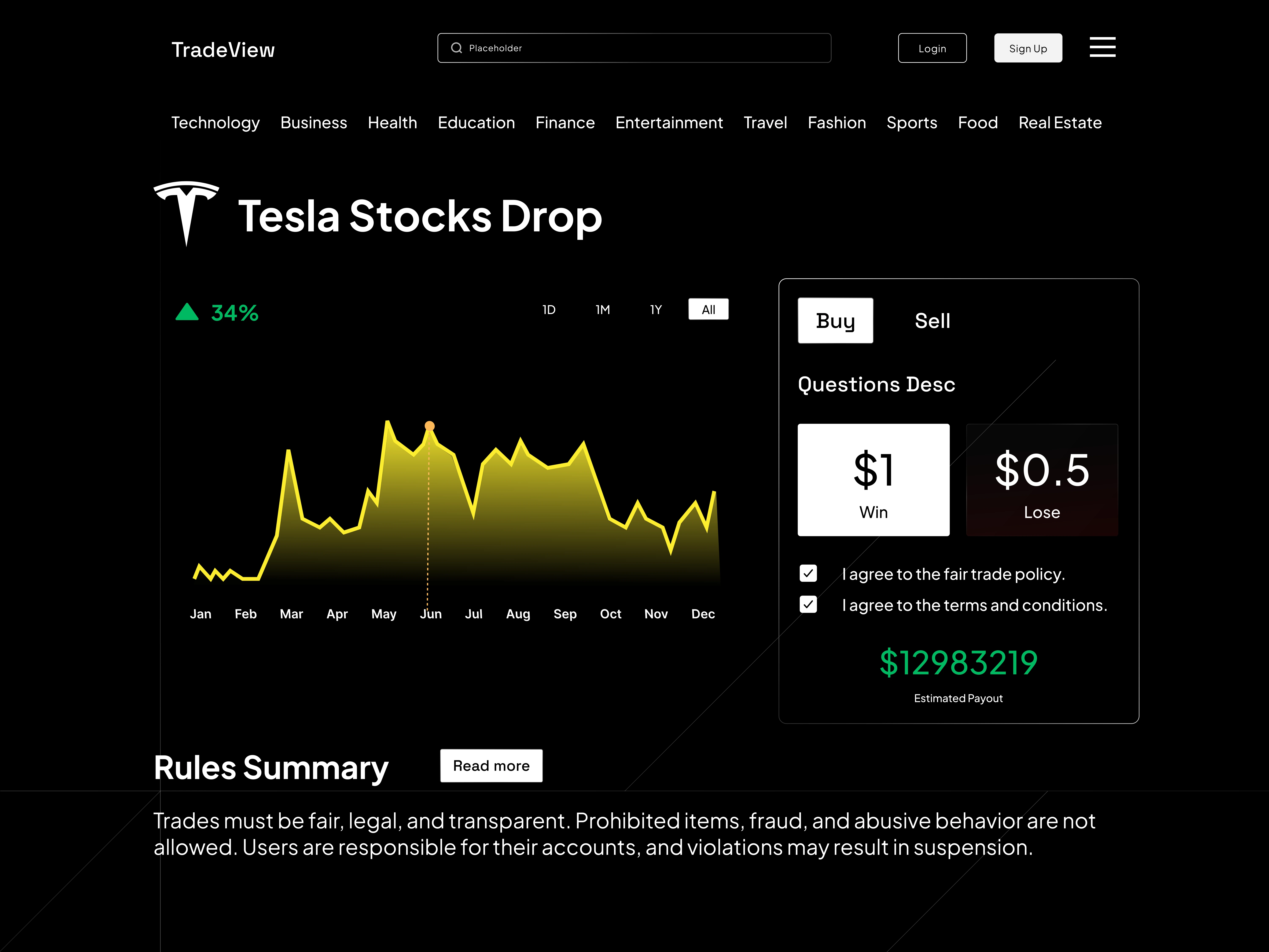
Odds shown as a plain Win/Loss price alongside a visible Rules Summary: the screen the entire app was built to lead someone to.
What I chose, what it cost, what changed.
Showed odds as a plain price, $1 or $0.50, instead of a percentage.
- A price is something you already know how to compare instinctively. A percentage is something you have to convert in your head before it means anything.
- Serious traders who read probability natively lose a bit of resolution with this framing.
- The core mechanic reads in one glance instead of requiring actual math.
Put a Rules Summary directly on every event page, never behind a separate link.
- A prediction market lives or dies on whether people trust the settlement is fair. Hiding the rules is the fastest way to look like a mockup pretending to be a real market.
- It eats real screen space on the busiest page in the whole product.
- A trust signal sitting right where the money decision actually gets made.
Went with a premium dark theme, glassmorphism included.
- A platform handling real money needs to feel expensive before it feels clever. Glassy black does that work without a single word of copy.
- It’s the exact visual language every fintech app reaches for by default, and TradeView doesn’t really escape that.
- Instant credibility on arrival, which is what frees up the prediction screen to be the strange, distinctive one.
Landing
A single green radial glow on black: serious fintech before a chart ever loads.
tradeview.app
Dashboard
The home base: balances, activity, and a way back into every open position.
tradeview.app/home
Prediction Event
Tesla Stocks Drop: Buy/Sell odds as a plain price, a visible Rules Summary. The whole reason the app exists.
tradeview.app/event/tesla-drop