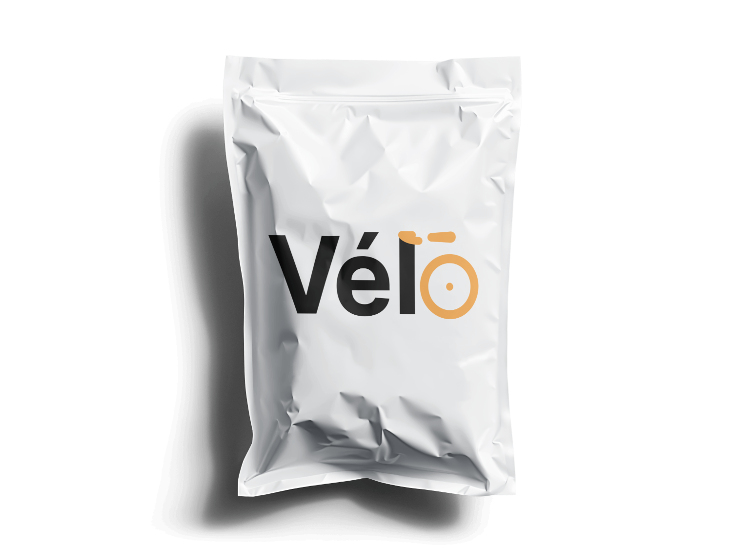
A cycling brand mark that never once draws an actual bicycle.
Vélo
2024
Brand identity, wordmark, applications
Solo
- One mark and no lockup rules, so nothing has to be maintained, placed or shrunk separately as the brand grows
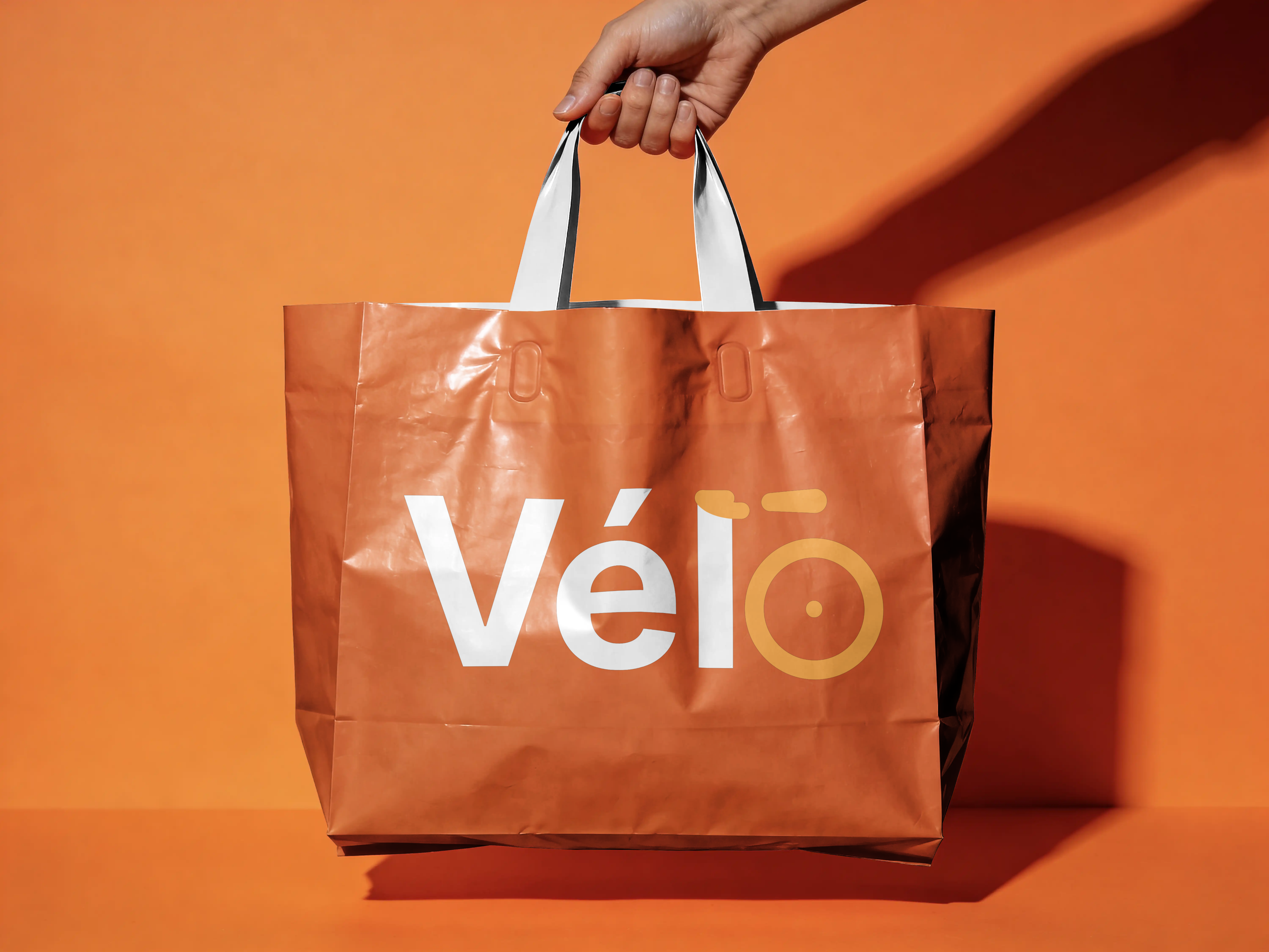
- A courier bag crossing traffic reads like a hazard vest instead of disappearing into a row of green delivery logos
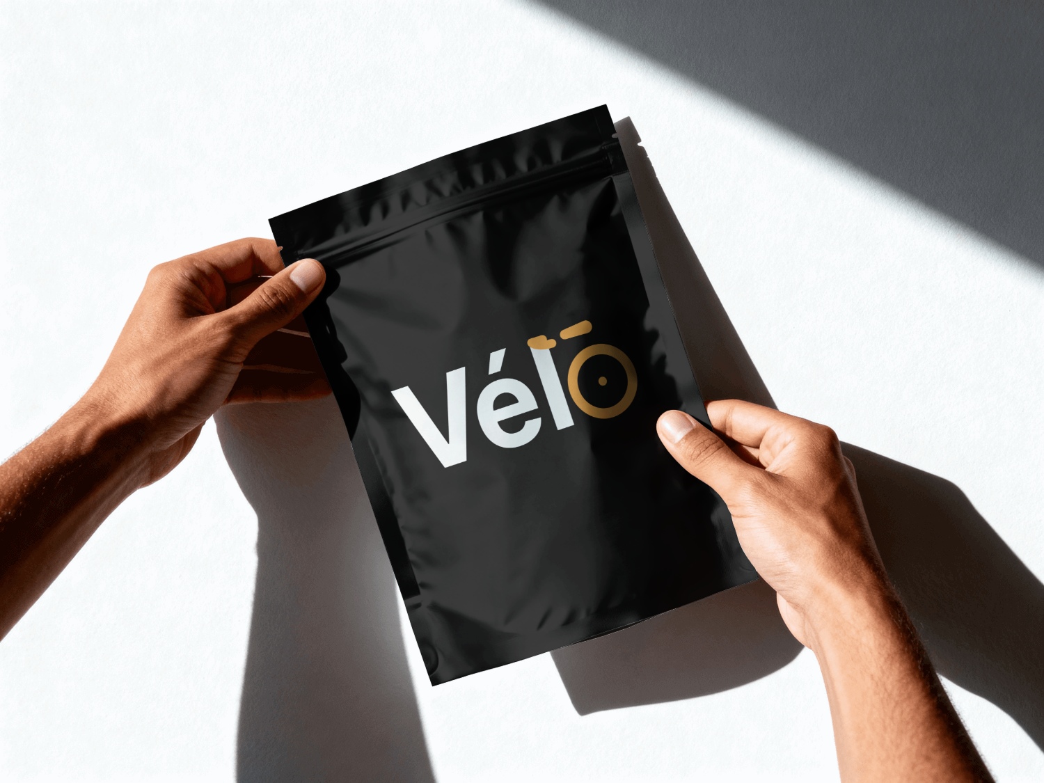
- Proven on six surfaces before I called it finished: bag, hot cup, cold cup, snack pouch, dark-store signage, billboard
- The bicycle lives inside the letterforms, so a rider, a barista and an app screen all get the same mark at the same cost
Vélo is a concept and nothing here went to production. The test it passes is the one most portfolio logos never take: holding its shape on six surfaces with different light, different distance and different hands on it.
The identity behind the Vélo courier concept: a cycling brand mark that has to hold up on a courier bag, a coffee cup, a snack pouch, and the side of a building, without ever leaning on a bike icon to prove what it’s about.
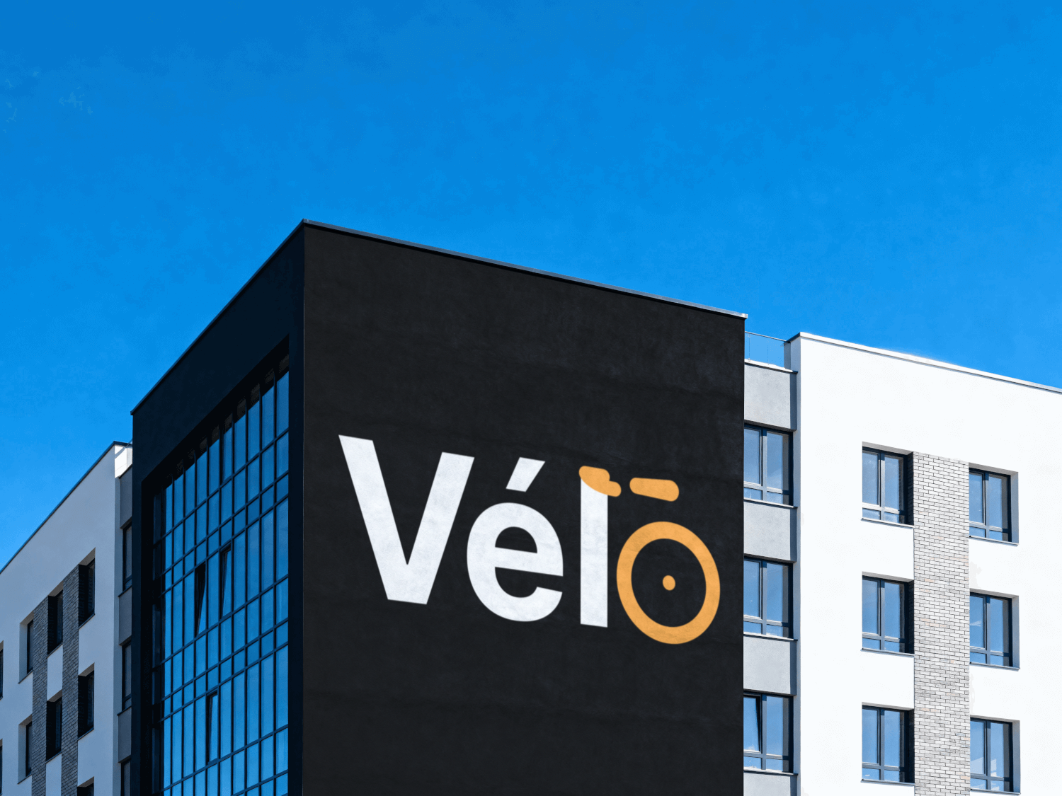
Build the bicycle reference straight into the letters instead of bolting an icon on next to them. The lowercase “l” doubles as a handlebar and seat post; the “o” closes itself off as a wheel.
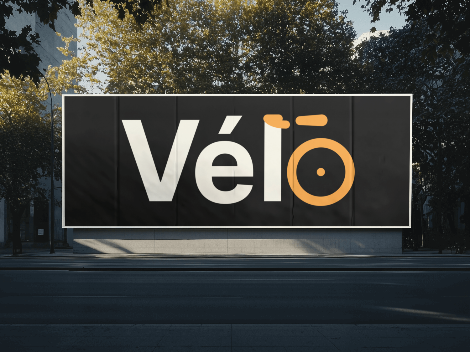
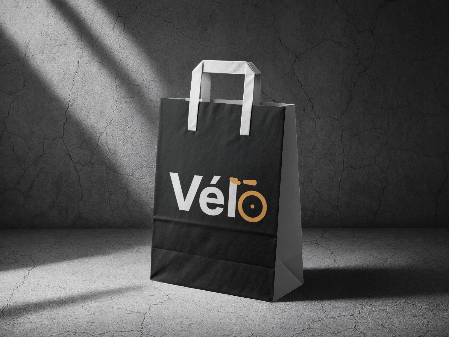
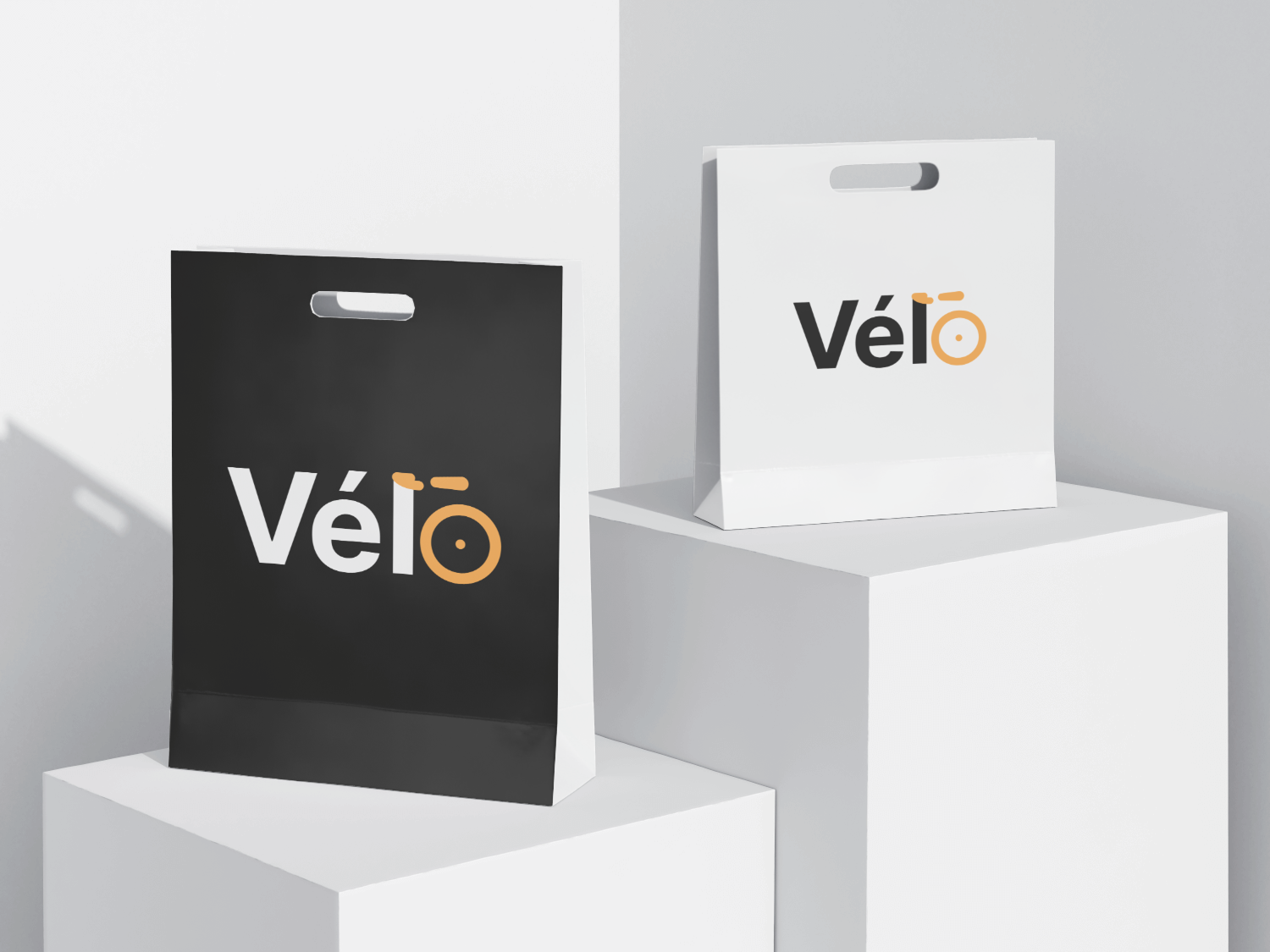
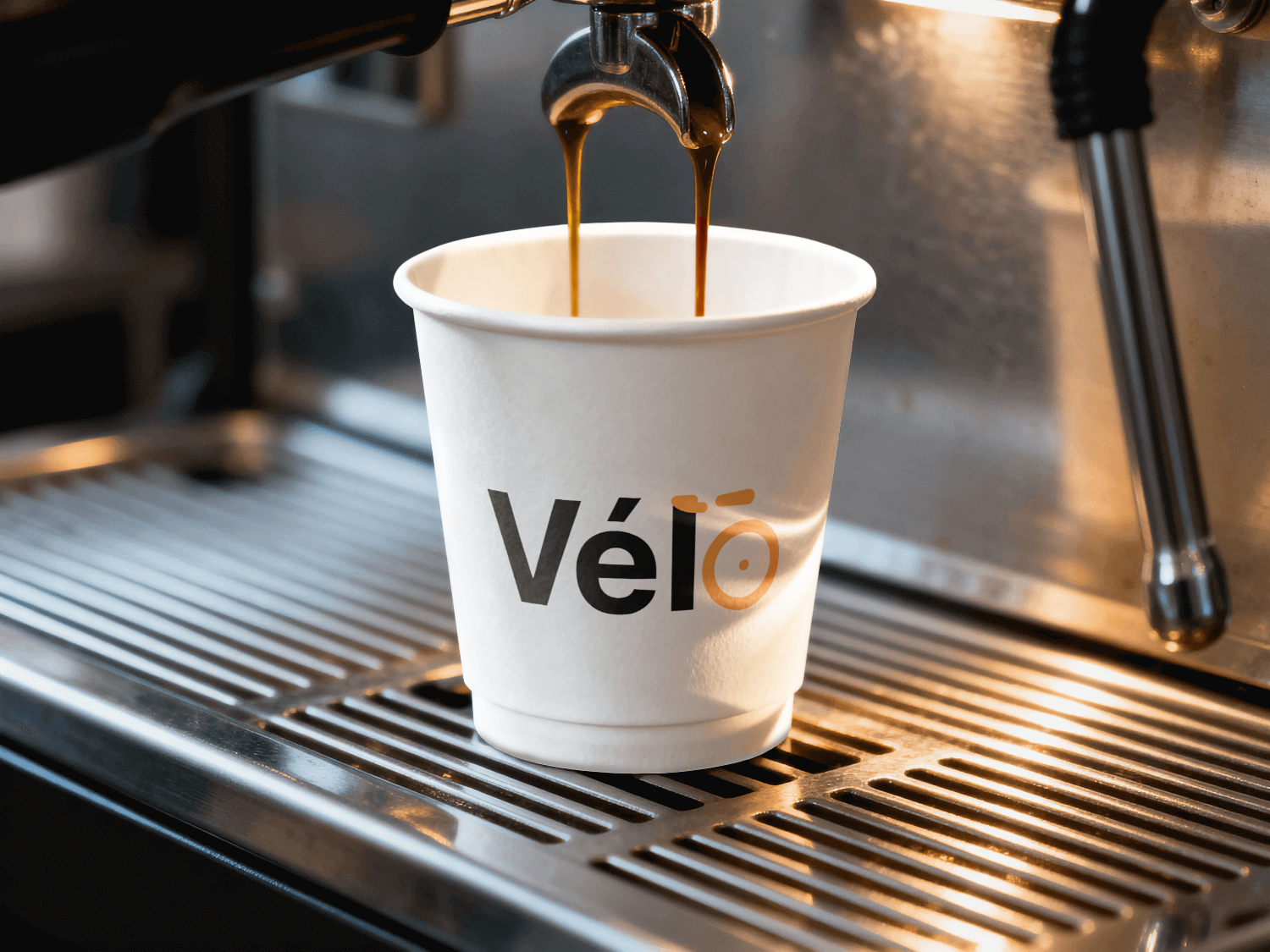
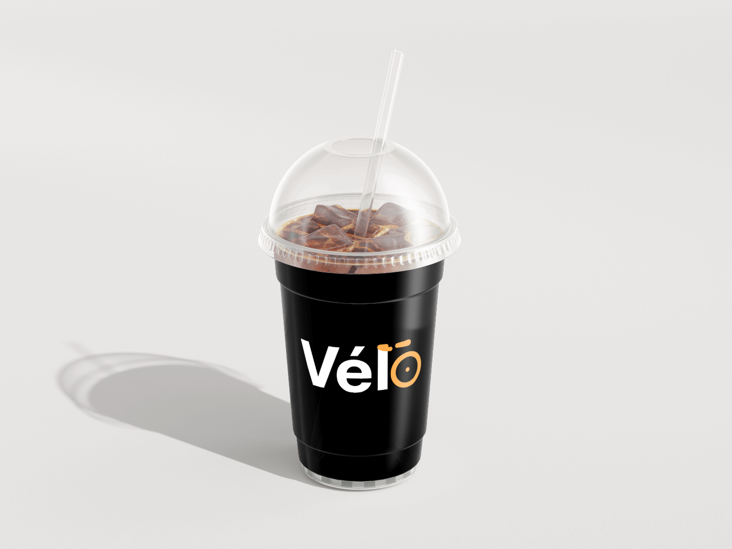
Orange, over the eco-green nearly every delivery brand defaults to, because a courier bag crossing traffic should read like a hazard vest, not a leaf.
- The bicycle lives inside the letterforms themselves. No icon sits next to the name, because a mark that needs a separate picture to explain itself is really two marks pretending to be one.
- A geometric sans, chosen so the brand reads as an app rather than a cycling club crest someone might sew onto a jersey.
- Orange, against the eco-green almost every cycling and delivery brand reaches for by default. A courier bag crossing traffic should probably read like a hazard vest, not a leaf.
- Bags, hot and cold cups, snack pouches, dark-store signage, out-of-home: each one setting up a different legibility problem, read across a street, gripped and tilted in a hand, lit from below at night.
- A wordmark that only works on a splash screen is basically a logo waiting to fail somewhere else later. Holding up across all these surfaces is the real test.
What I chose, what it cost, what changed.
Built the bicycle into the letterforms, never placed beside them.
- An icon sitting next to a wordmark is one more thing to maintain, place, and shrink correctly. Inside the letters, it physically can’t be separated from the name.
- Almost nobody clocks the reference on a first glance. It ends up being a small reward for the second look instead.
- One single mark, no lockup rules to enforce, nothing lost even at a very small placement.
Orange instead of the expected eco-green.
- Every cycling and delivery brand out there already runs green. On a courier bag actually crossing traffic, orange is also just the more honest safety colour.
- Green would have signalled “sustainable” to people instantly. This mark doesn’t get that association for free.
- A mark that doesn’t quietly disappear into a sea of green delivery logos.
A geometric sans over any kind of heritage or crest treatment.
- Vélo is an app that happens to use bicycles as its subject, not an actual cycling club. The type needed to say “software,” clearly.
- A geometric sans is honestly one of the least distinctive typographic choices available here.
- A wordmark that sits comfortably on both a delivery bag and an app splash screen.
A wordmark that only works on a splash screen isn’t actually finished. It’s a logo waiting to fail somewhere else, later, when it matters more. Every application here forced a real decision: the reversed mark on the black bag had to hold up at reading distance from across a street, the cup lockup had to survive being gripped and tilted in someone’s hand, and the building sign had to work lit from below at night. None of that shows up if a mark only ever exists inside a brand deck.