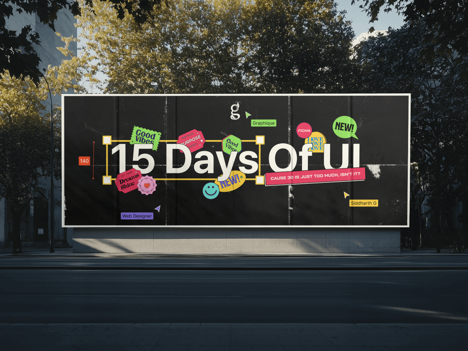
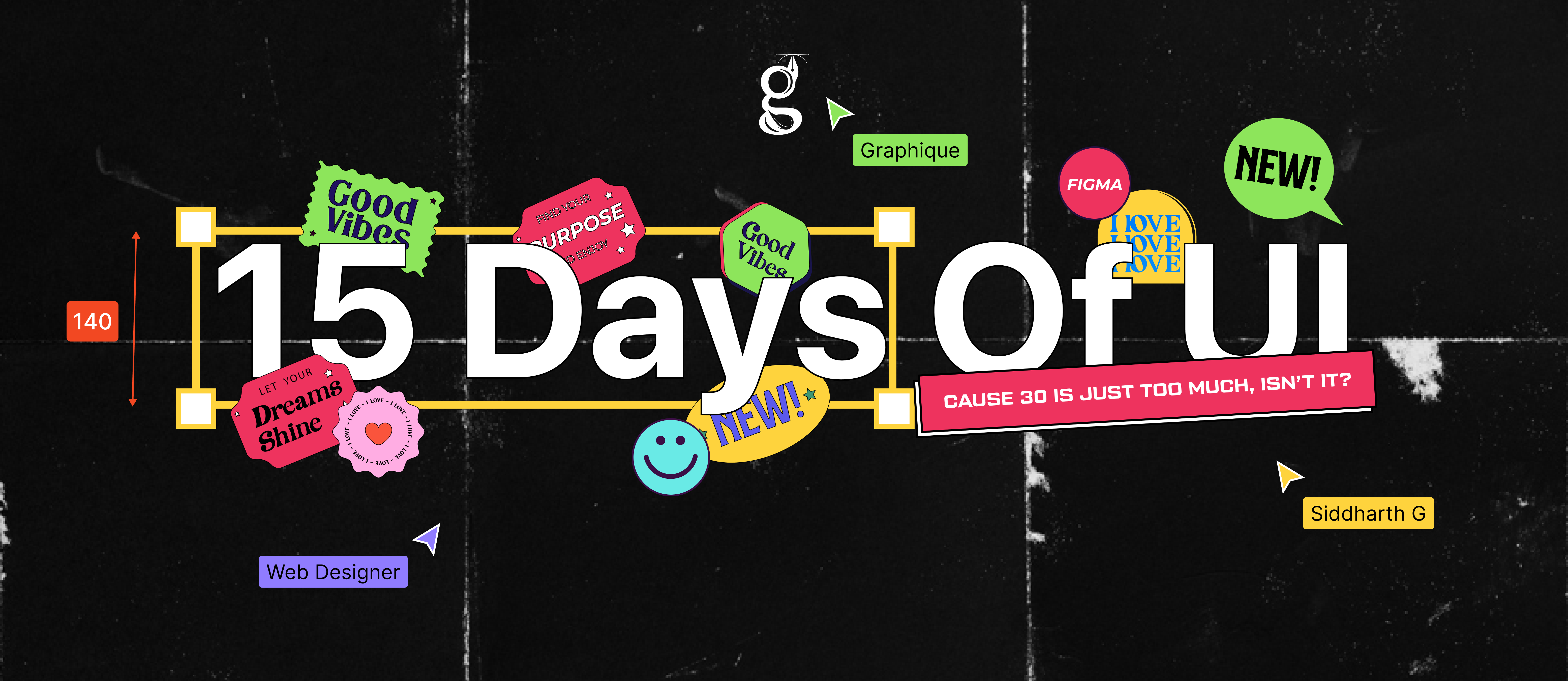
The launch poster, designed before the fifteen-day challenge behind it even existed.
15 Days of UI
2025
Art direction, cover design, typography
Solo
7000Instagram views
- The invitation carried the challenge on its own, with no finished screens behind it to borrow credibility from
- One cover held across Dribbble, Behance and Instagram without a redraw per platform
- Fifteen days of daily posting had a front door before day one, so the series launched instead of drifting
Posted to the Graphique feed as the challenge announcement. The number is small and it is public. The link below goes straight to the post if you want to check it.
Launch key art for a self-initiated design challenge: fifteen days, one screen a day, announced into the usual design-community spaces on Dribbble, Behance and Instagram.
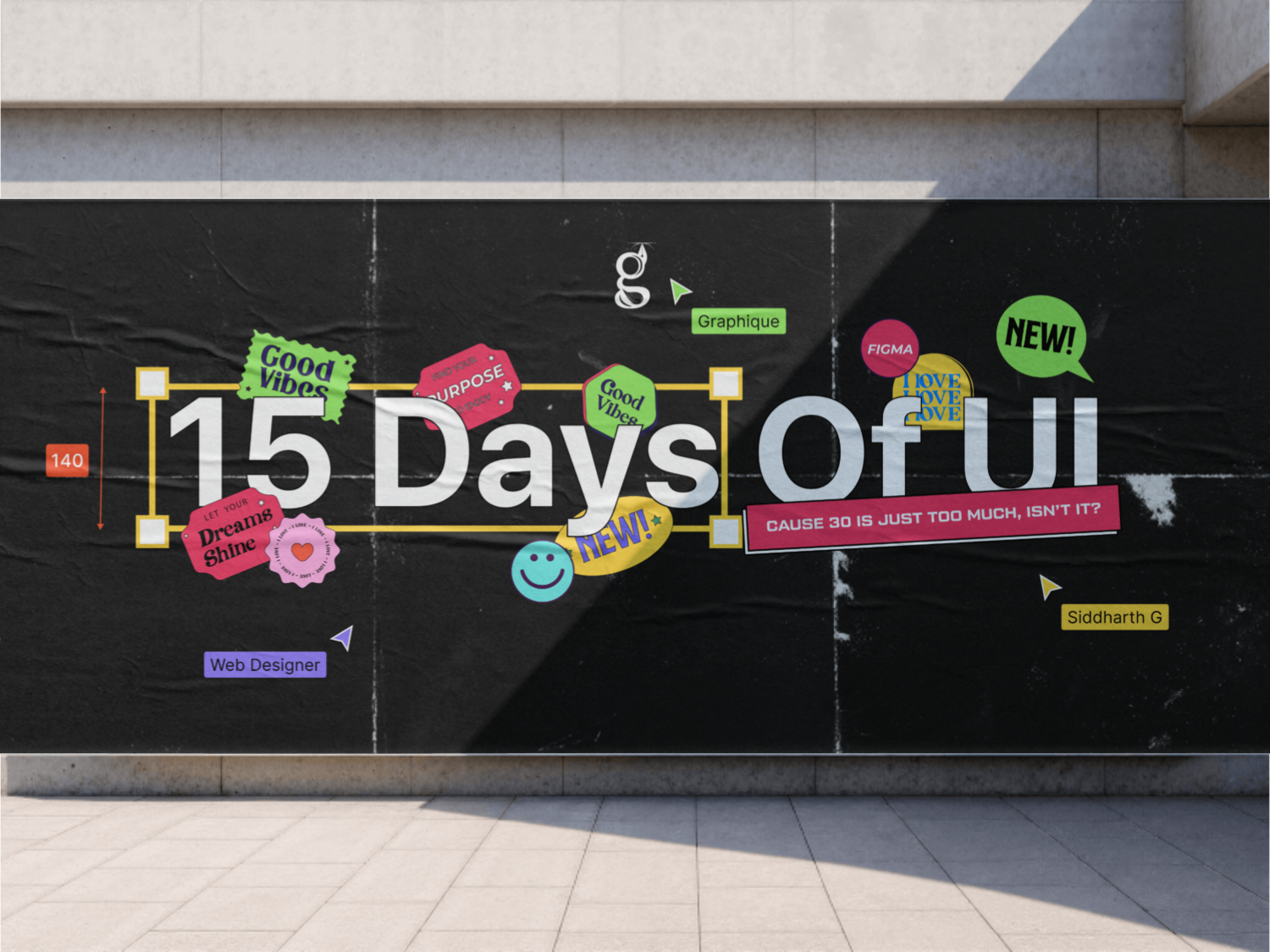
A launch asset really only has one job: stop the scroll before there’s anything real behind it to see yet. So I built the invitation first, and let it prove on its own whether the challenge was worth showing up for.
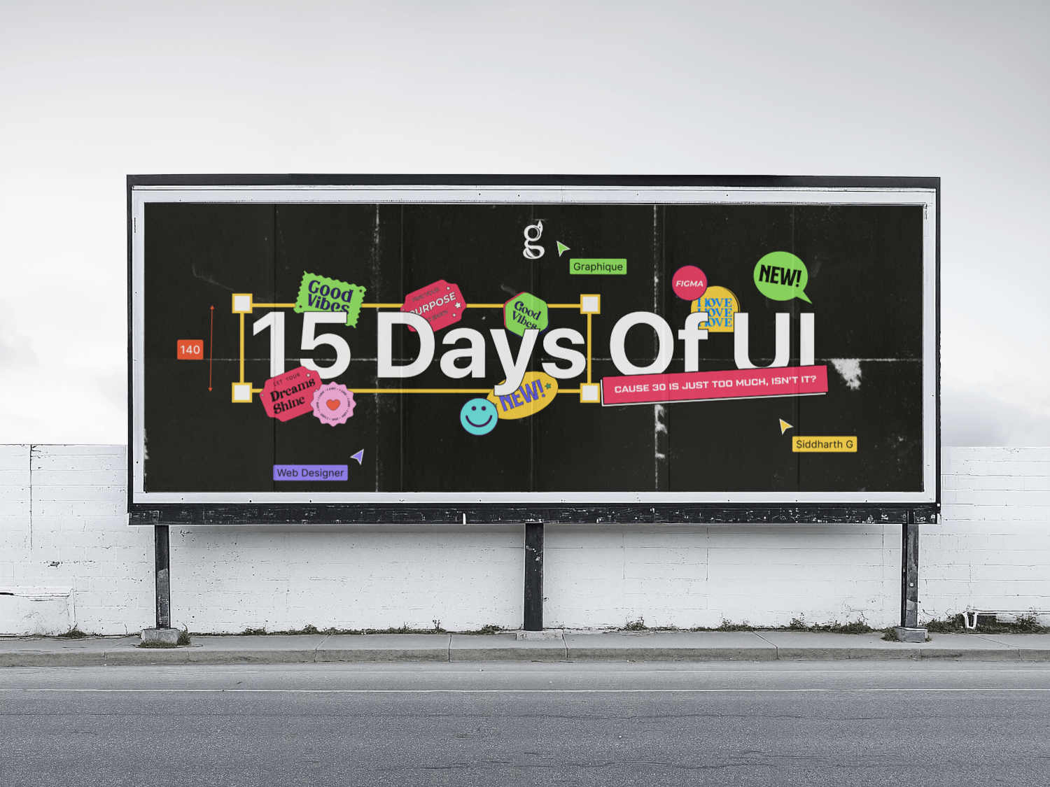
I designed the cover before day one of the challenge existed, mostly to find out for myself whether an invitation alone could actually stop a scroll.
- Figma-native elements (cursors, frames, component chrome) so the artwork stays visibly tied to the software the whole challenge actually lives inside.
- Distressed concrete underneath everything, mostly so the stickers have a surface to feel stuck to instead of just floating on a flat background.
- Maximalist, on purpose. Stickers, arrows, overlapping layers. A quiet cover for a challenge post tends to read as an apology rather than an invitation.
- Tool credit and my handle stay visible on it. A challenge post is a small brand launch whether you treat it that way or not, and a launch with no name on it doesn’t really go anywhere.
What I chose, what it cost, what changed.
Went maximalist: sticker-heavy and loud.
- The cover is competing with an infinite feed, not with other posters pinned to a wall. Restraint just loses that particular fight.
- It’ll date itself hard. This reads like exactly the year it was made, on purpose or not.
- A cover that’s genuinely hard to scroll past without noticing it.
Figma-native elements over generic UI illustration.
- The challenge itself happens inside Figma. Borrowing its own visual furniture makes the poster feel like it came from inside the work, not next to it.
- The reference only really lands for other designers. Everyone else just sees stickers.
- An announcement that reads as insider rather than advertised at people.
Built the launch asset before any of the work it was launching existed.
- It isolates the actual question. If the invitation can’t earn attention on its own, no amount of good screens behind it later fixes that.
- The cover couldn’t reference a single real screen, because none of them existed yet.
- A real test of whether a launch asset stands on its own. It did.
The cover came before the challenge, deliberately: a test of whether the launch itself could earn attention before a single real screen existed behind it. Stickers, arrows, a distressed concrete texture, loud enough that a quiet, minimal treatment would have read as an apology instead of an invitation.