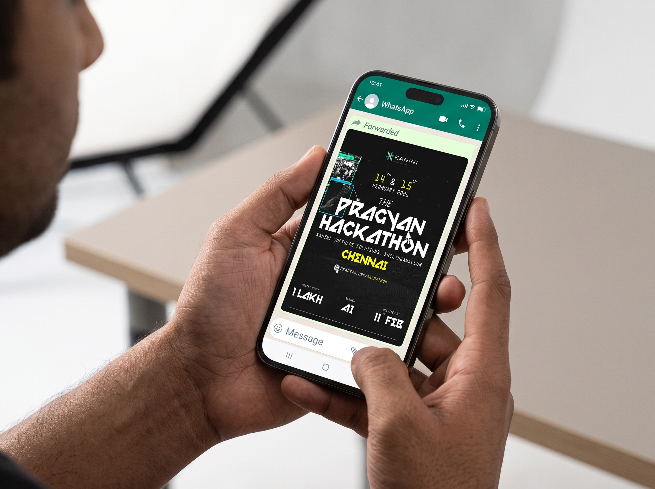
Turning event details, sponsor identities, and key dates into a launch poster built to grab attention and get people to show up.
Pragyan Hackathon × Kanini
2026
Poster design, client briefing, typography
Solo, briefed by Pragyan’s sponsor liaison team
600Registrations driven
307Instagram likes
₹1,00,000Prize pool announced
- Kanini ran it as the hackathon’s branding on their own channels and offline at the venue
- Date, city, prize and deadline survive WhatsApp compression, which is where most registrants met the poster first
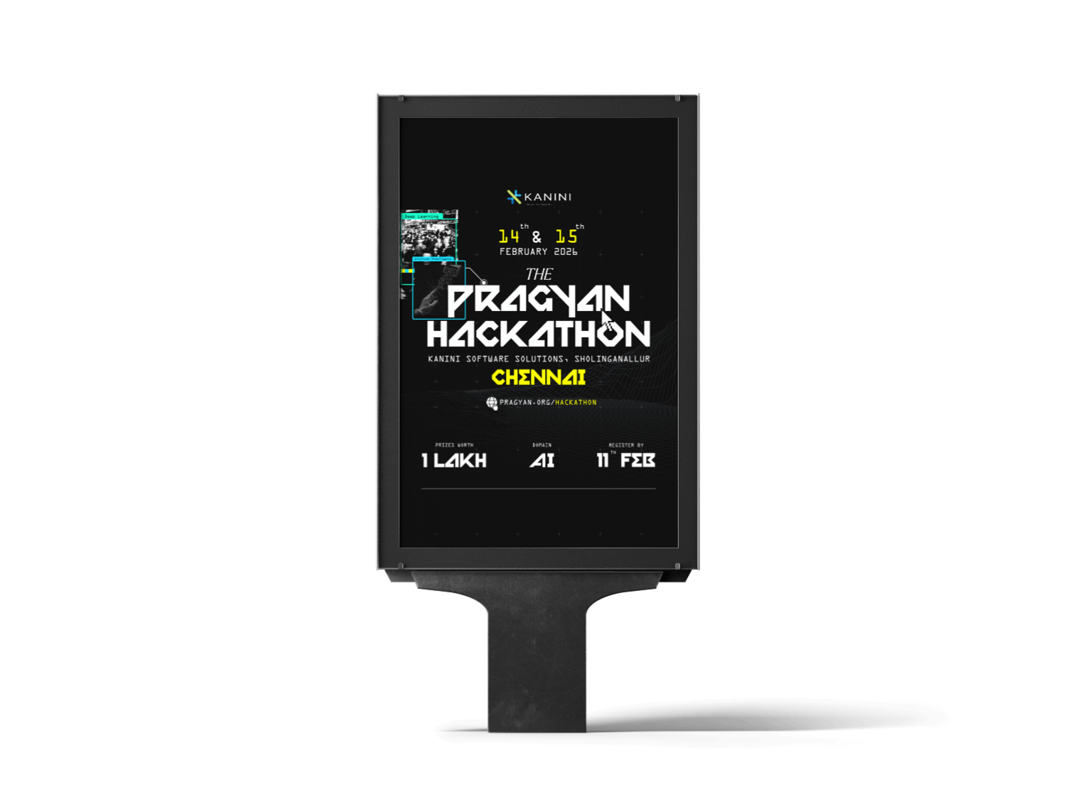
- One design cut four ways: flat poster, standee, Instagram square, WhatsApp forward. The sponsor never had to commission a second
- A fixed checklist of sponsor requirements arrived looking like a decision instead of a form somebody filled out
This is the one piece in this section where someone else decided it was good enough to put their company’s name on.
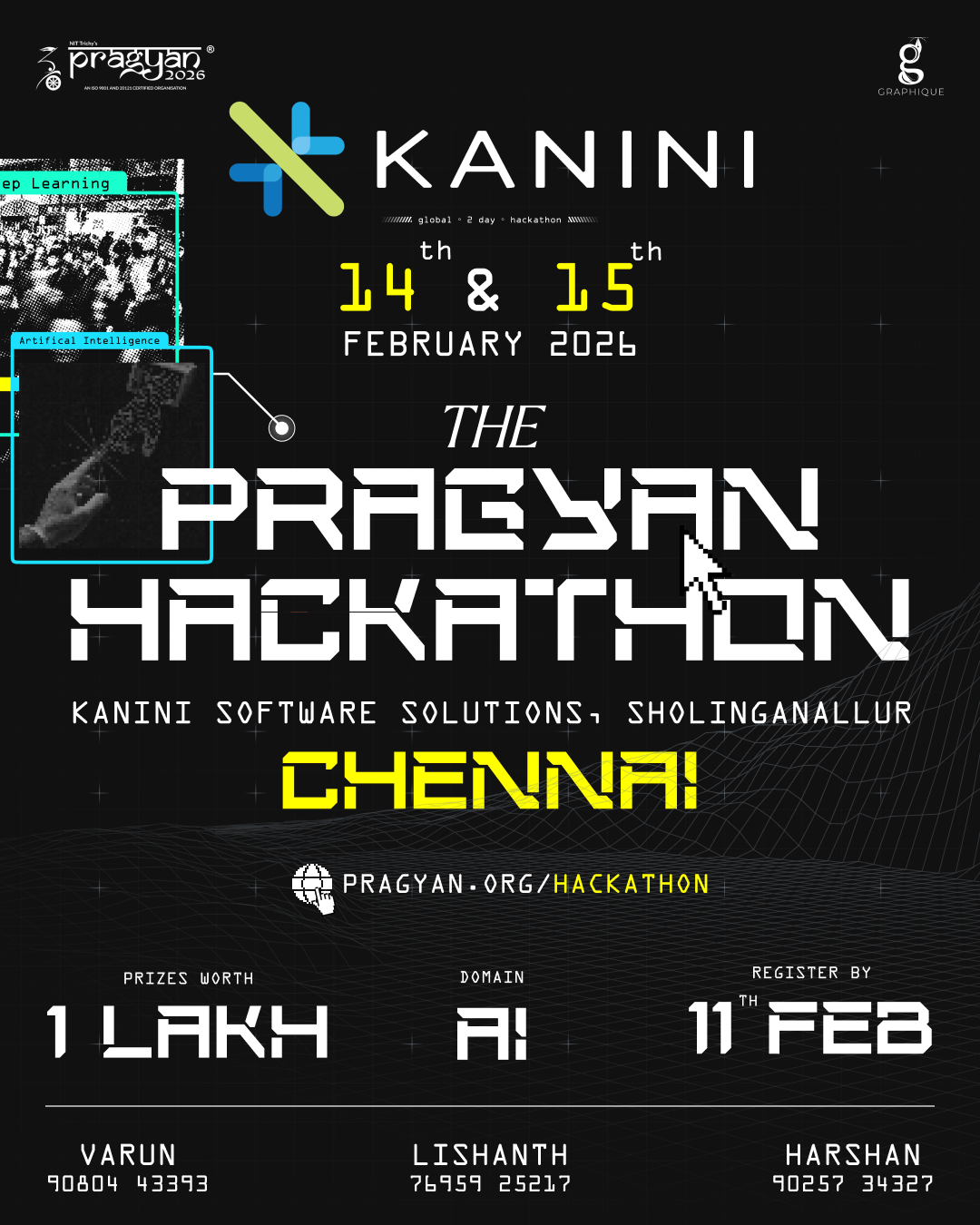
Kanini Software Solutions sponsored a two-day AI hackathon for Pragyan. I was handed a genuinely non-negotiable list: dates, prize, domain, sponsor logos, registration deadline, every bit of it needing to stay legible on a phone screen.
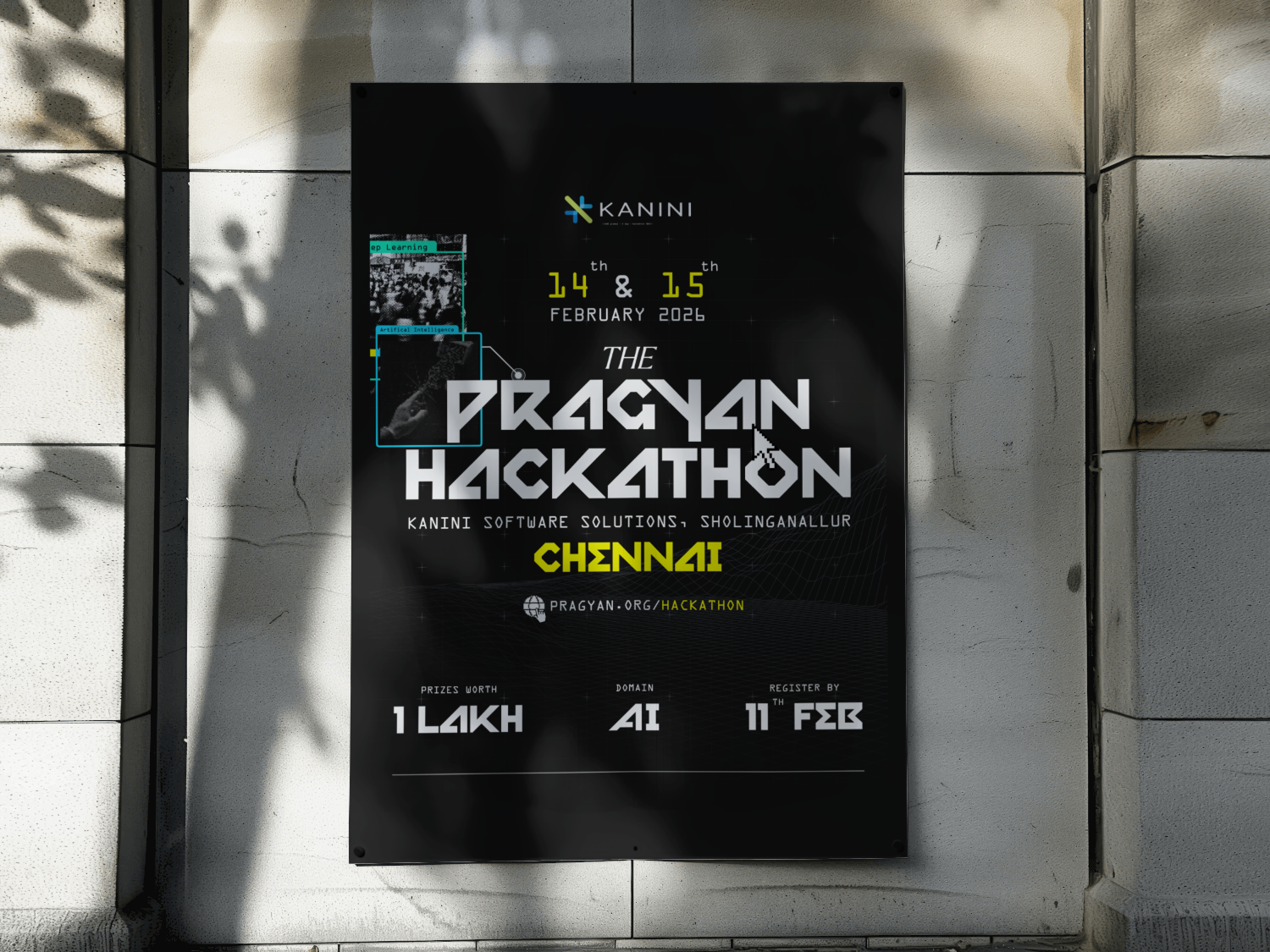
Make the constraint itself look like the concept: an ML and techy vibe running through everything, photo chips that read like scan windows, and exactly one highlight reserved for the four facts that actually matter.
sid.design···
2,481 likes
sid.design Pragyan × Kanini: 2 days, one prize, zero excuses to sit this one out. 💻
A sponsor handed me a checklist of dates and logos. The scanline texture and the photo chips are basically what turned that checklist into an actual poster.
- Near-black with a scanline texture running through it, so the poster feels like it belongs in an actual data centre rather than a college hallway.
- A slab typeface heavy enough to hold its own against a busy dark background at phone size, because phone size is genuinely where this poster gets read.
- One highlight, reserved for exactly four things: date, city, prize, deadline. Everything else stays in the greyscale, no exceptions.
- AI and machine-learning coded elements, weighted toward deep learning and image processing specifically, to carry the hackathon’s actual theme instead of some generic “tech” mood.
- Flat poster, standee cut, Instagram square, WhatsApp forward. The same four facts had to survive every one of them intact.
What I chose, what it cost, what changed.
One highlight, four facts, nothing else on the poster in colour.
- A poster whose entire purpose is a deadline should make that deadline the one thing visible from across a room.
- Every other element on the poster runs in strict greyscale, so there’s less visual richness to lean on elsewhere.
- Date, city, prize and deadline read first on a phone, every single time.
A scanline texture instead of just a clean dark background.
- It gives the poster an actual reason to look the way it does. A clean dark background is a container; scanlines make it a place.
- Fine scanlines are the first thing to get lost once print quality drops, which is a real risk for a poster like this.
- The poster reads like it belongs in a Chennai tech park, not a college hallway.
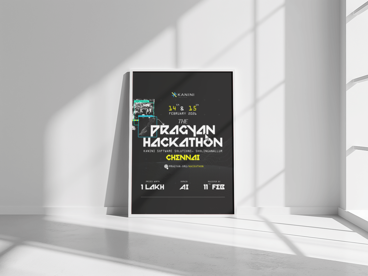
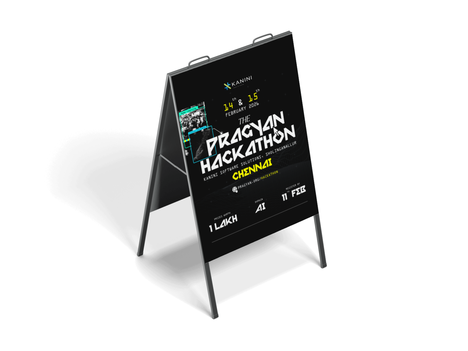
A heavy slab typeface over a lighter technical sans.
- A thinner technical face just disappears against a busy dark ground. The weight is what keeps the required text legibly required.
- Slab at this weight is blunt rather than elegant, and honestly the whole poster is a little blunt because of it.
- Legible even forwarded at WhatsApp-compression size, which is exactly where most people actually saw it.
Converged on one direction fast and stopped, rather than exploring more options.
- A sponsor brief with a hard deadline doesn’t leave room to fall in love with a direction that isn’t working.
- There’s exactly one route through this poster. No real B option ever got developed alongside it.
- A better poster, faster, than a wide-open brief probably would have produced.
A sponsor brief is a different kind of constraint from a self-set one. Every fact on this poster was already non-negotiable before I ever opened the file. The design work wasn’t really about inventing a concept; it was about making a checklist of dates and logos feel like an actual decision instead of a form someone filled out. The scanline texture and the "scan window" photo chips are what did that work. They gave the poster a reason to look the way it does, rather than just a place to park the required text.