A season that sounds nothing like the last one, and looks the part.
The Pragyan Podcast
2025
Cover design, and this episode’s guest
Solo
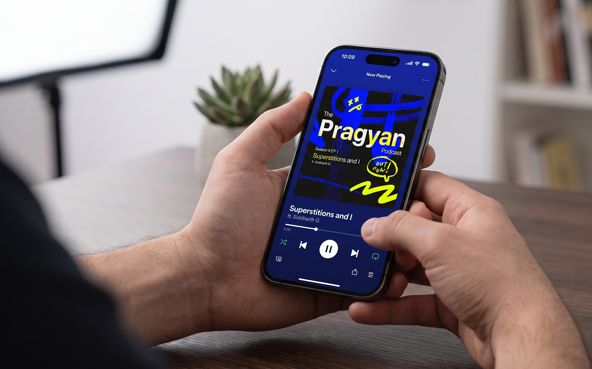
- Season 6 is unmistakable from season 5 at directory-thumbnail size, which is the only place the artwork gets seen
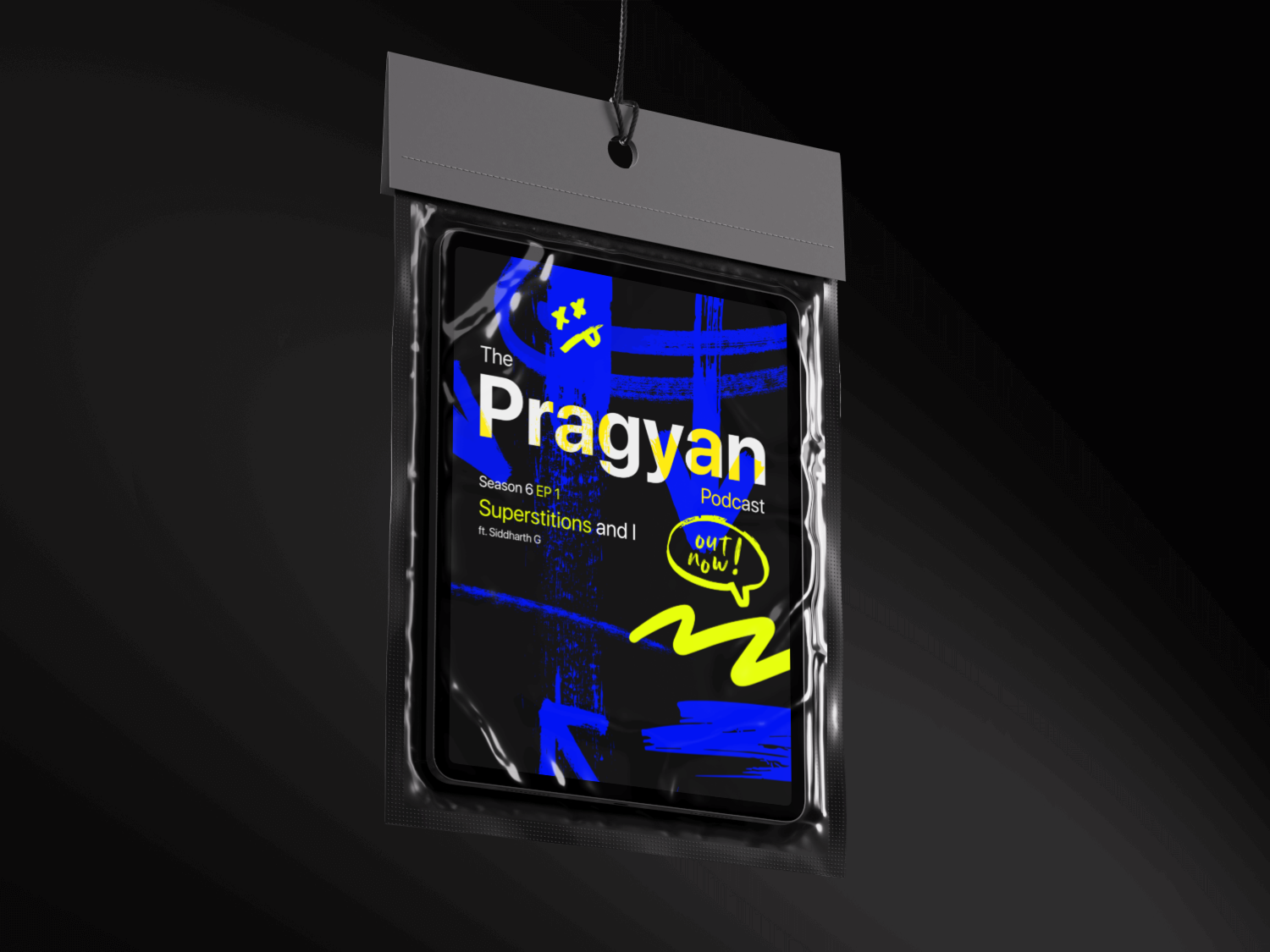
- One file covered the app tile, the flyer, the standee and the taped poster, so the season launch never needed a second design
- The wordmark holds its letters at thumbnail scale, where the single-colour version lost about half of them to the background
The honest gap: nothing here ties season 6 back to season 5, so a returning listener gets no visual thread between them. That is the next problem, and one small corner mark that outlives every season would solve it.
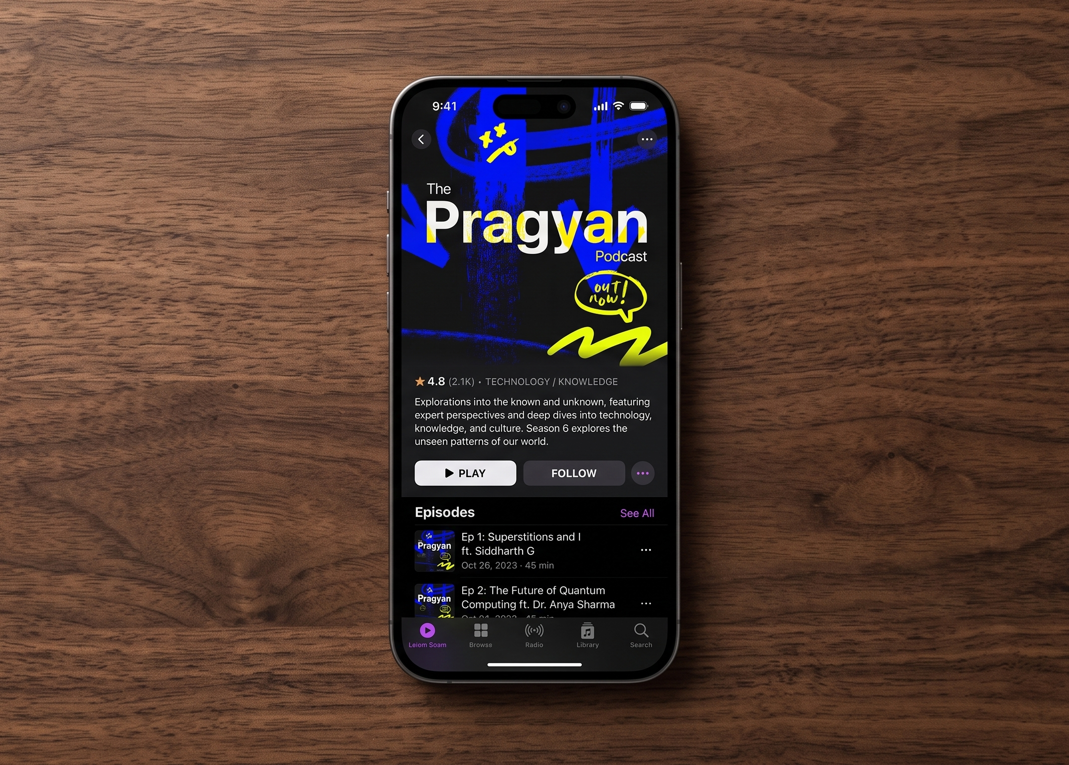
Cover art for a new season of the Pragyan Podcast. New mood, new energy, and honestly, a new personality.
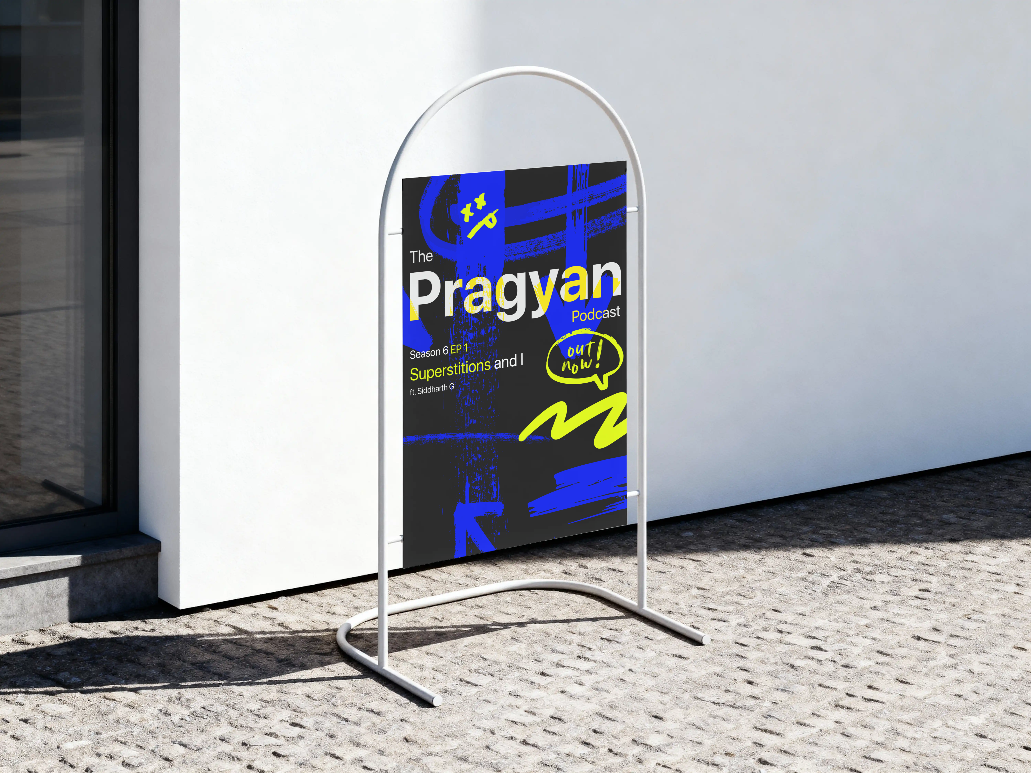
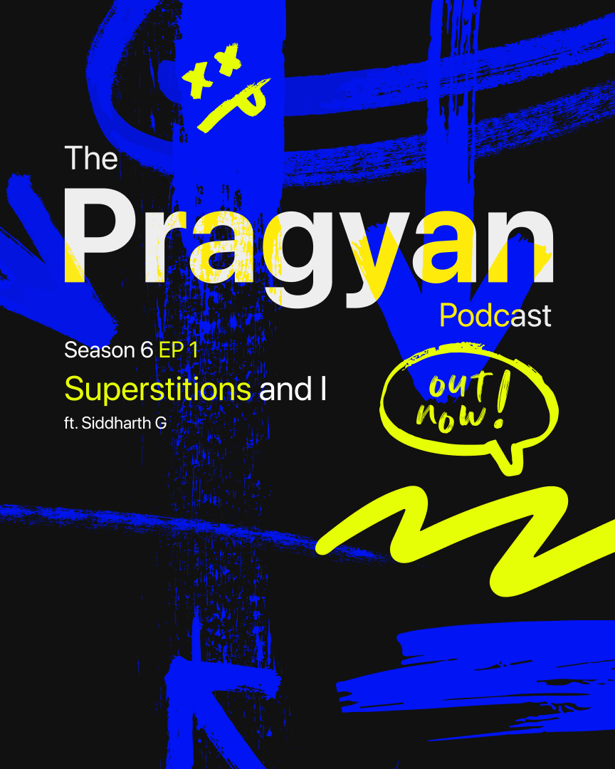
A show that prides itself on not sounding rehearsed shouldn’t have cover art that looks focus-grouped into place. Spray-paint marks and a hand-drawn art, and I let that rustic grsffitti be the entire cover.
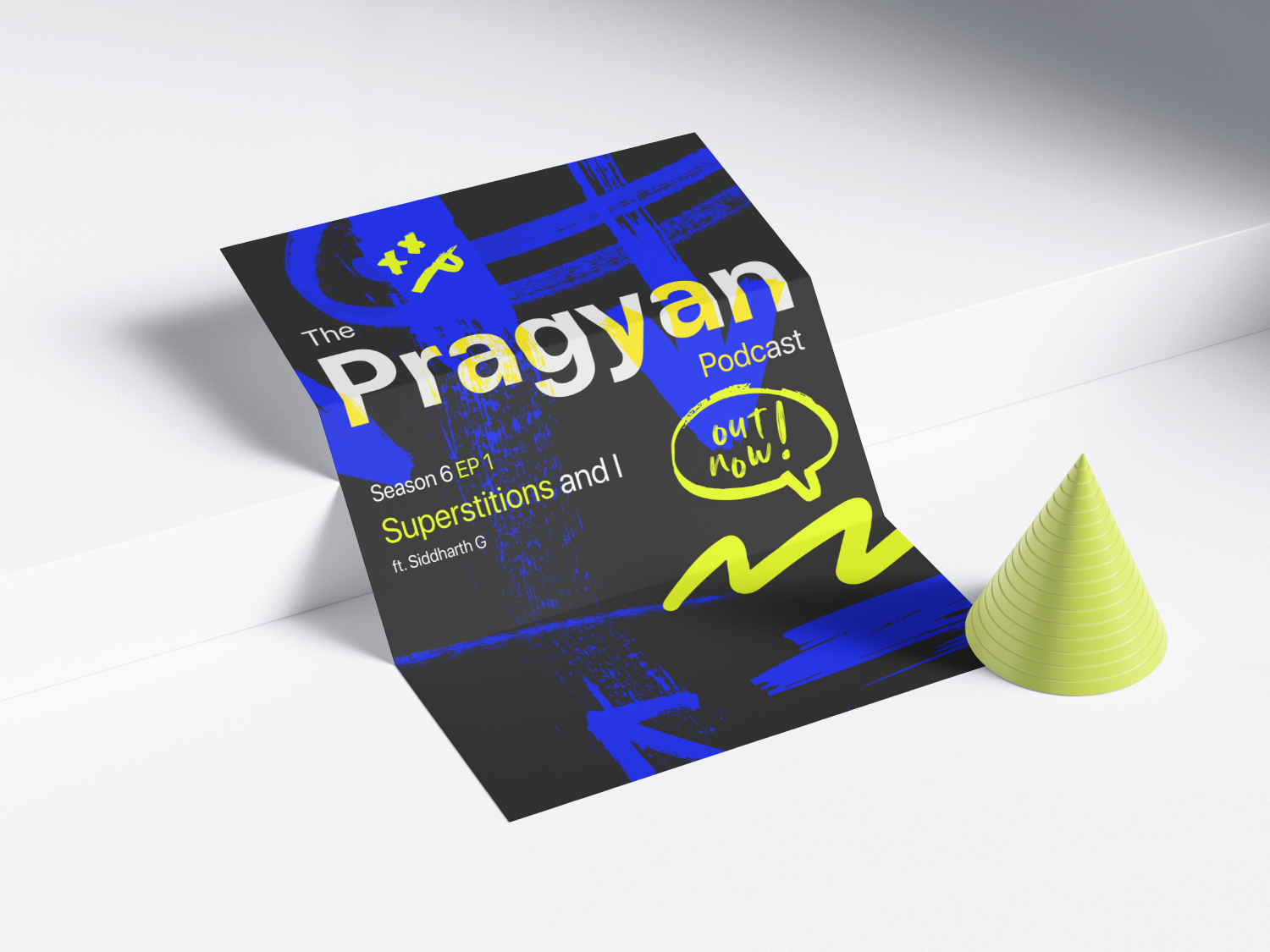
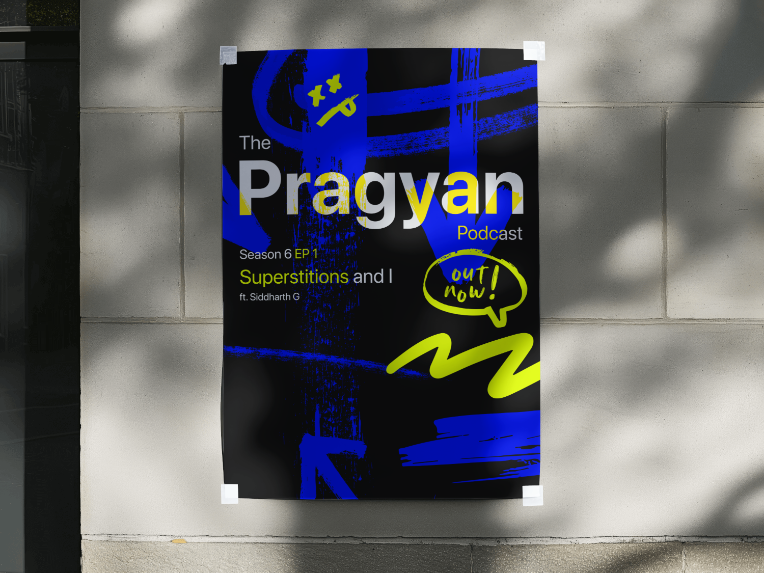
Season 6 shares almost no visual DNA with season 5, and I genuinely still can’t decide if that’s the show’s strength or just a thread I forgot to tie off.
- Spray-paint blue and citron. The show’s whole appeal is that it doesn’t sound rehearsed, and the palette needed to say that before the type ever got the chance to.
- A hand-drawn “out now!” speech bubble. A podcast is fundamentally a voice medium, so the art should probably sound a little like one too.
- Split across white and yellow so it still reads at the size it’ll actually be seen at: a podcast app thumbnail, not a poster on a wall.
- Nothing about this ties the season back to the last one. If I kept building this system, I’d add one small corner mark that survives every season, so a returning listener recognises the show at a glance regardless of what else changes.
What I chose, what it cost, what changed.
Broke completely from last season’s sticker-collage cover.
- Each season carries its own mood, and a cover that inherits the last one flattens that difference into a template nobody asked for.
- It costs real continuity. Someone scrolling past both seasons back to back has no visual thread connecting them.
- A cover that reads as this season and nothing else. Whether that’s actually a strength is genuinely still open, for me too.
Hand-drawn type for the “out now!” bubble instead of set type.
- Everything else on the cover is flat and fairly constructed. That one hand-made element is what keeps the whole thing sounding like a voice.
- It’s deliberately the least tidy thing on the artwork, polish-wise.
- Art that behaves the way the show actually sounds.
Split the wordmark across two colours.
- At app-thumbnail size, a single-colour wordmark against this background loses roughly half its letters to the noise.
- At full poster size the split looks slightly unnecessary and a bit fussy, a cost worth paying since the smaller size matters more.
- The name survives at the size it’s actually going to be seen at.
Designed the whole cover to leave the app.
- It doubles as the launch asset: flyer, standee, taped poster. Something that only worked as a square would have needed a second design anyway.
- The square format itself is good rather than perfect, since it wasn’t optimised as the single primary format.
- One artwork that covered every surface the season announcement actually needed.
Last season’s cover was a sticker collage: busy, dense, collected. This one is three spray-paint marks and a hand-drawn speech bubble, and I let it be that different on purpose. The thinking was straightforward: a podcast that prides itself on not sounding rehearsed shouldn’t have art that looks focus-grouped into consistency. The tradeoff is just as real, though. Someone scrolling past both seasons back to back has no visual thread to grab onto, and that’s genuinely the next problem worth solving, not this one.
sid.design···
2,481 likes
sid.design Season 6, Episode 1: Superstitions and I, out now 🎙️