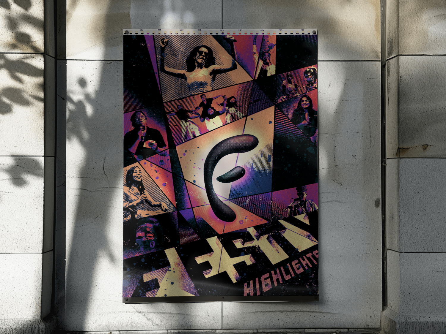
Twelve strangers’ phone photos, edited until they looked like one photographer’s work.
Festember Highlights
2026
Photo curation, composite design
Solo
602Instagram likes
- Twelve photos off twelve different phones ship as one photographer’s set, with no reshoot and no per-image colour grade
- A four-day festival compresses into one image someone can send to a friend who missed it
- Roughly two hundred photos edited down to twelve, which is the part of the job no treatment rescues if you get it wrong
- The film-strip frame gave the organisers a recap format they can rerun next year with new photos and no new design
Most of this section is illustration built from nothing. This one is not. The skill on display is curation: taking messy reality and matching it into a single coherent system.
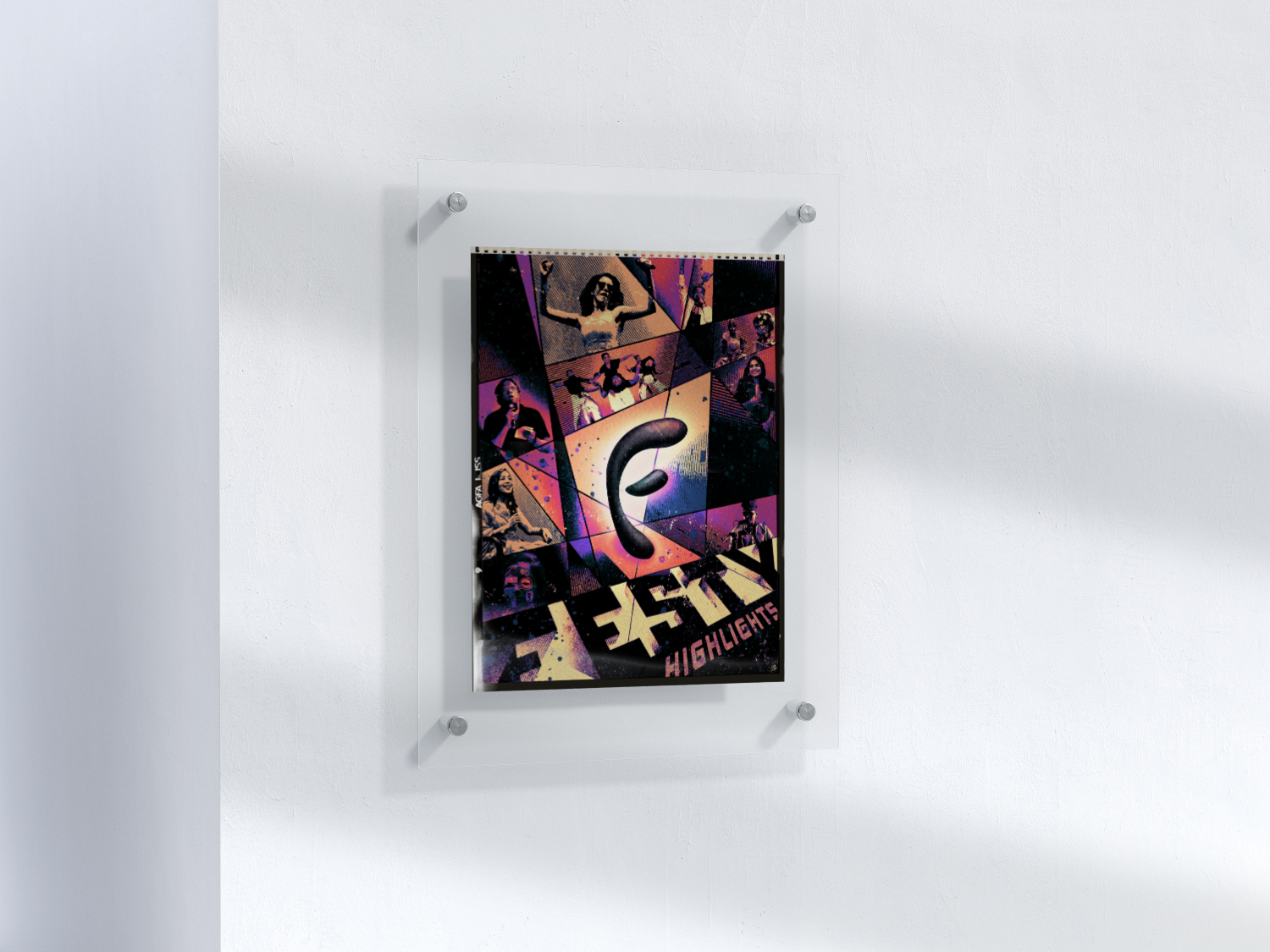
A recap of a whole season of Festember in one shareable image, built entirely from real event photos that had genuinely nothing in common besides the event itself. Twelve phones, a dozen different lighting setups, one poster.
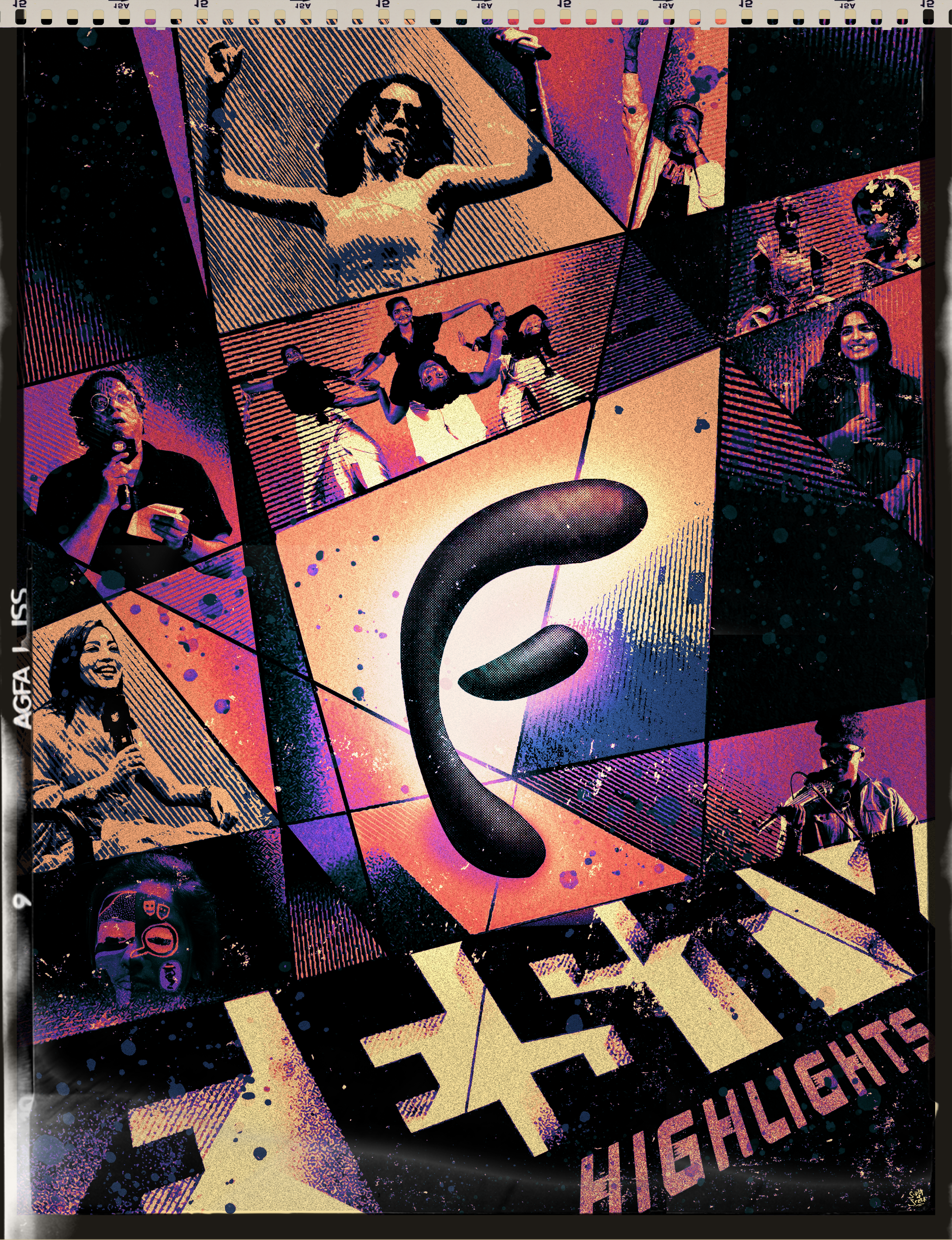
The curation is the design, in this one. One halftone pass, one film-strip frame, one grid, and a dozen mismatched shots start looking like they were always agreeing with each other.
Twelve strangers’ phone photos went in. One halftone pass later, it genuinely looks like a single photographer shot the entire festival.
- A single halftone duotone applied across every photo. This is the piece doing the real heavy lifting. It’s what makes twelve completely unrelated exposures look like they came off one camera.
- Film-strip framing, sprocket holes and all, so casual phone photos read as memories rather than screenshots someone pulled off their camera roll.
- Every source photo cropped to the same aspect ratio before layout, so the grid reads as one deliberate sequence rather than a loose scrapbook.
- A large central "F" mark, mostly so there’s one place for the eye to actually land in what’s otherwise a fairly busy grid.
- Which twelve photos out of roughly two hundred actually tell one story: that judgement call is essentially the whole design. No amount of treatment rescues the wrong twelve.
What I chose, what it cost, what changed.
One halftone duotone across every photo, with no exceptions made for any of them.
- Colour-matching a dozen different phone cameras by hand is basically impossible. Removing colour as a variable just makes the question moot.
- Nobody looking at this actually gets to see what the night really looked like in colour.
- Twelve unrelated shots that read as if they came from one shoot.
Film-strip framing with sprocket holes.
- A plain grid of phone photos reads as a camera roll. A film strip reads as a memory, which is closer to what a recap is actually selling.
- The frame itself eats real estate that could otherwise have held more photos.
- Casual snaps that end up carrying the weight of something closer to documentation.
One central mark instead of an evenly weighted grid.
- Twelve equally weighted tiles give the eye nowhere to actually rest, and no real order to read them in.
- It cost one full photo slot, handed over entirely to the mark.
- A busy composition that still has one clear entry point.
Curated the set down to twelve instead of collaging everything available.
- The skill being tested here is editorial, not generative. Knowing which twelve actually tell the story is most of the real work.
- Plenty of genuinely good photos, and plenty of people who appear in them, simply didn’t make the final cut.
- A recap that reads as a narrative rather than an archive dump.
None of the source photos were actually shot for this. They were phone snaps from a dozen different people, in a dozen different lighting conditions, and the real design problem was getting them to agree with each other: one halftone duotone treatment, one film-strip frame, one grid. The skill here isn’t generating imagery, it’s editorial. Knowing which twelve photos out of two hundred tell one story, and figuring out what treatment makes them look like they always belonged together.