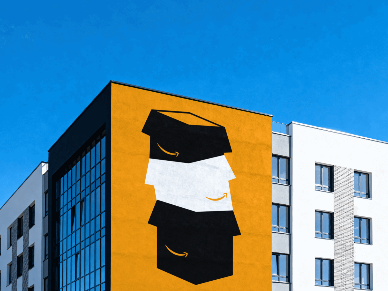
Three brands. One silhouette each. Nothing else allowed to carry the idea.
Less Is More
2026
Concept, illustration, typography
Solo
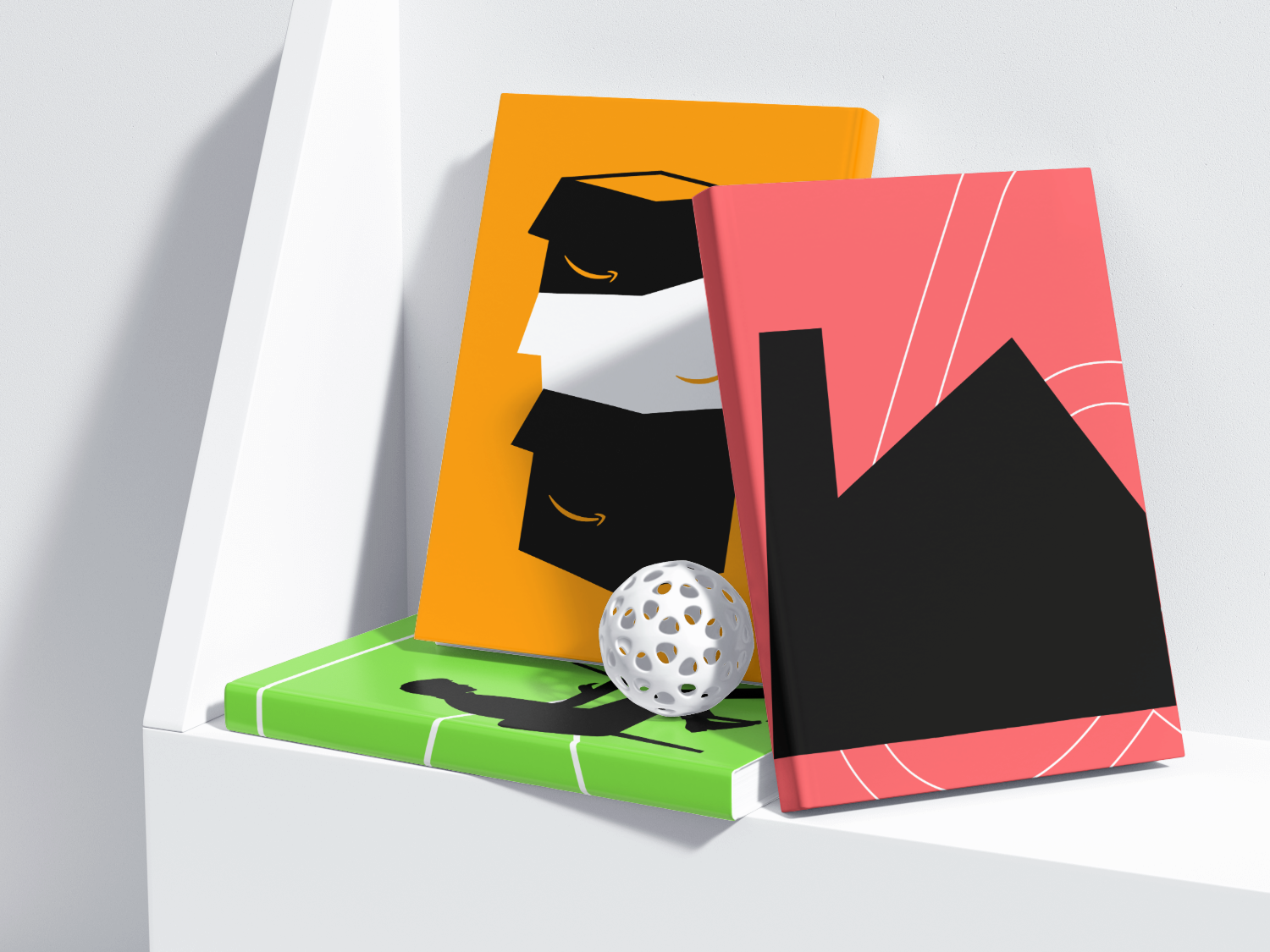
- The argument lands from across a room, before anyone gets close enough to read the question under it
- Three industries share one visual grammar, so the set reads as a body of work rather than three unrelated posters
- Any idea that needed a second colour to explain itself got cut, which is the editing brand work runs on and a single logo never shows
Nobody commissioned these and nothing shipped. What the series proves is that I can hold one constraint across three posters running, which is the harder half of identity work.
A speculative brand-strategy poster series spanning three industries at once: hospitality (Airbnb), ecommerce and logistics (Amazon), and media (YouTube). Three companies, three unanswered questions, one poster apiece.
Find a question big enough that the company’s own board would actually argue about it, then answer that question with one colour, one black silhouette, and one line of type. Nothing else allowed in.
sid.design···

2,481 likes
sid.design Can Airbnb redefine booking workspaces? One question, one shape, one color. 🧡
sid.design···

2,481 likes
sid.design Can Amazon crack repair & refurbish? A stack of boxes says more than a paragraph.
sid.design···

2,481 likes
sid.design Can YouTube make learning collaborative? A desk, a green field, no question mark needed.
Cutting the fourth colour took noticeably longer than adding it would have. Three posters, one shape each, and every one of them, I fought to keep that plain.
- No mark of my own anywhere in this. Each poster borrows the brand it’s questioning and reduces it to a single black silhouette: a person, a stack of boxes, a desk.
- One per poster, chosen for what it means rather than which brand owns it. Coral for a workspace you actually live in. Amber for the delivery box. A flat sports-jersey green for a platform everyone already pictures in red.
- One line, one size, one position, on every poster. The question is the only text allowed on the page, and it’s never allowed to compete with the silhouette for the middle of the frame.
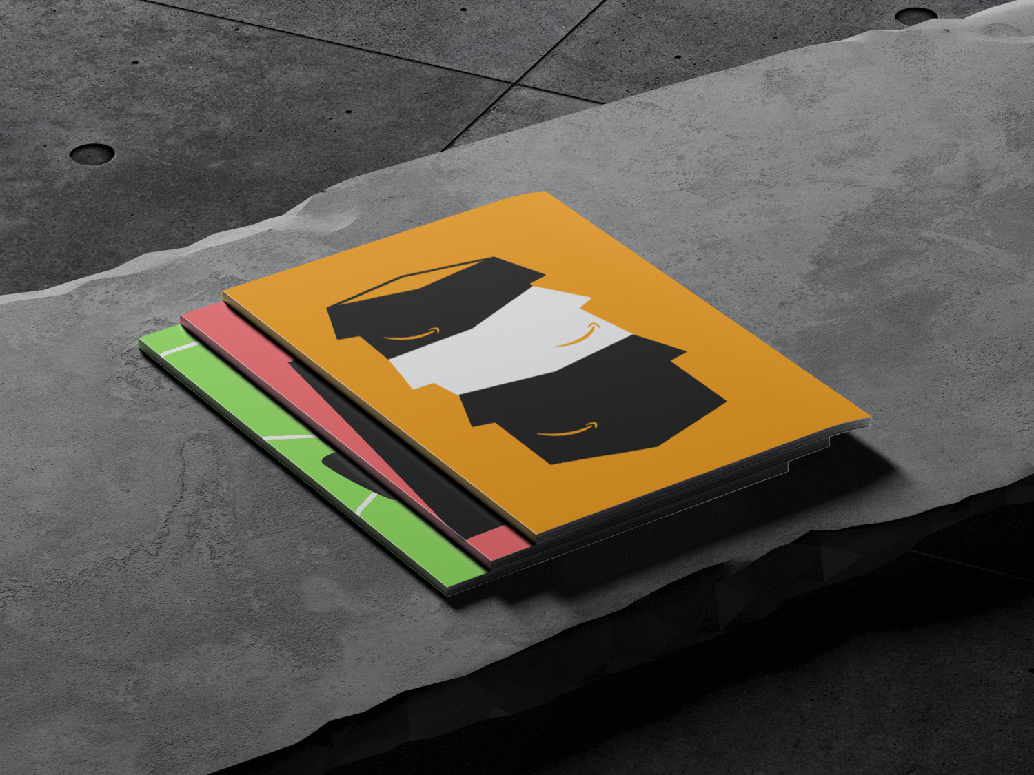
- The same margins and silhouette placement across all three, so the set reads as a run the moment you see it, before you’ve actually read any one poster.
- If an idea couldn’t survive being reduced to a single human shape, I decided it wasn’t finished. Most drafts died right around the second colour.
What I chose, what it cost, what changed.
Coral for Airbnb, not the tech blue you’d expect.
- The question was about workspaces people actually live in, and coral feels domestic in a way no tech blue ever will.
- Nothing on the poster matches Airbnb’s real brand palette, so it costs a little brand recognition on first glance.
- The colour makes the argument before the type gets a word in.
Amber for Amazon, because that’s the colour of the box.
- The whole poster is stacked delivery boxes. If the subject is cardboard, the colour didn’t really have another option.
- Amber on black is the least legible pairing of the three at small sizes. It just doesn’t hold contrast as well.
- A poster where the palette and the illustration end up making the exact same argument.
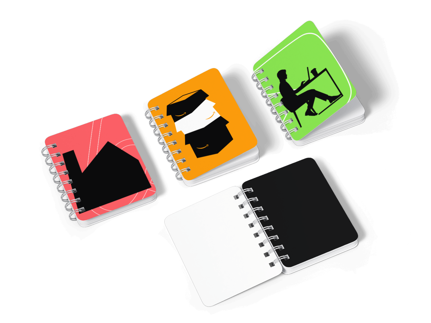
A flat sports-jersey green for YouTube.
- A platform this welded to red in everyone’s head gets more interesting the second you look at it through a completely different lens.
- It’s the poster in the set that takes longest to actually place. Recognition suffers a little for the surprise.
- The one people stop on and actually work out what they’re looking at.
Exactly one silhouette, no more, on every poster.
- A second shape turns it into a composition. One shape stays a claim, and a claim is what a strategy poster is supposed to be.
- There’s nowhere left to put a secondary idea. Every secondary idea that came up during the process just got cut.
- Three posters a stranger could read from across a room.
Each of these started life as a paragraph, a real debate some product team could plausibly be having behind closed doors. The rule I gave myself was deliberately brutal: strip the paragraph down to one question, then answer it with a single silhouette and a single colour, with nothing else in the frame allowed to carry meaning. Most drafts died around the second colour. The ones that made it through were the ones where the shape alone told a stranger what the poster was about, before they’d read a single word of the question.