Beauty With An Atitude, a self-initiated campaign built for a real haircare brand..
Moxie
2026
Creative direction, campaign concept, social media design & copywriting
Solo, unsolicited
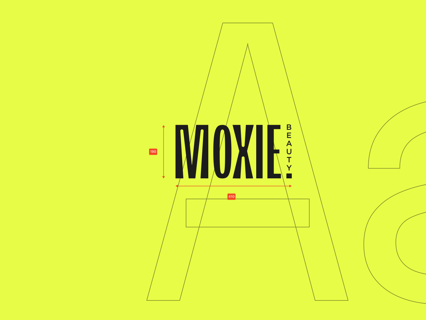
- Six posts a social manager can publish in any order without them reading as six different brands
- Yellow against a category running lilac and sage, so the bottle wins the first decision a shopper makes on a shelf
- One sticker shape and one lighting setup, so the seventh post costs a fraction of what the first one did
- A printed zine proving the system survives leaving the feed, which is the question a retail buyer asks first
Moxie never asked for this and never used it. What it demonstrates is production economy: a system where the next post keeps getting cheaper to make, which is the thing a brand actually buys when it buys an identity.
Moxie is a haircare brand built around making haircare feel effortless, expressive, and personal. With a focus on hair health and everyday styling, it offers a canvas for bold visuals, playful messaging, and a fresh take on haircare culture. Here are a few pieces presented along that same interesting brand principle of energy.
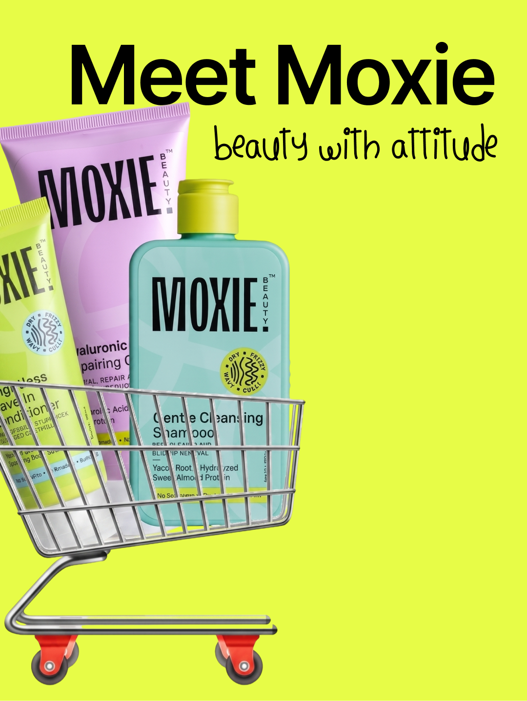
Beauty with attitude. A yellow loud enough to win the shelf, and one recurring idea tying all six pieces together as one brand.
sid.design···
2,481 likes
sid.design Beauty with attitude, built to earn a spot in the cart. 🛒
sid.design···
2,481 likes
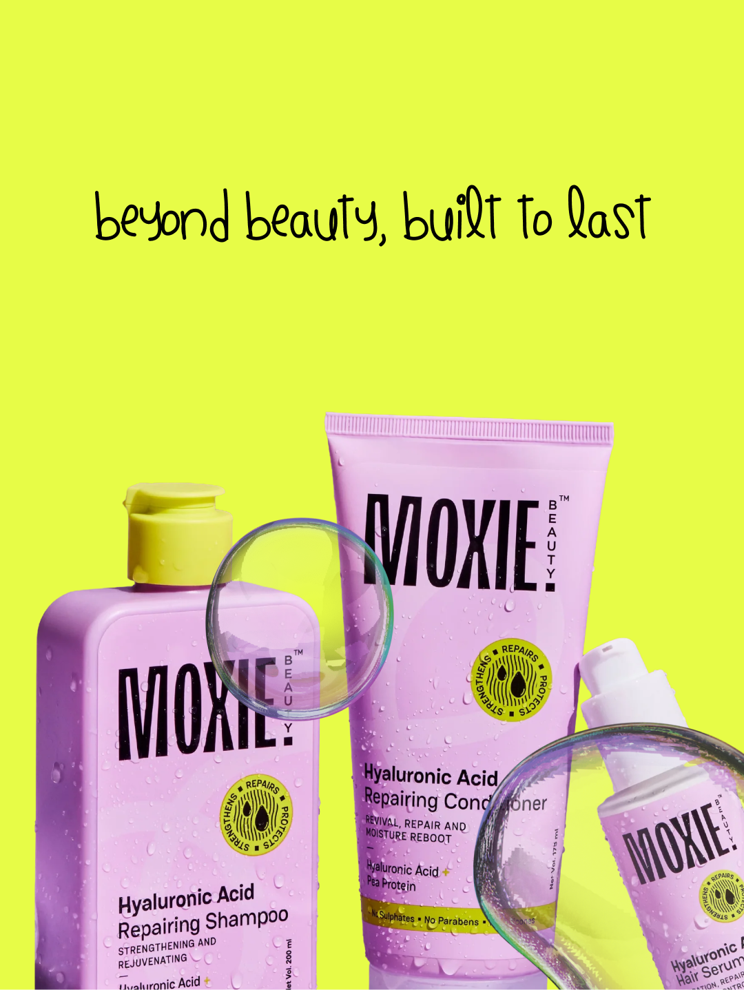
sid.design Beyond beauty, built to last. 🧴
sid.design···
2,481 likes
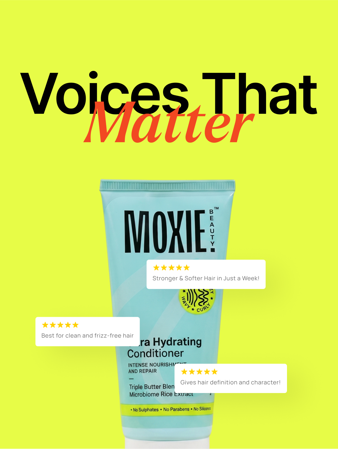
sid.design Voices that matter. Real reviews, no filter. 🧡
Nobody at Moxie asked for any of this. I ended up building six pieces of a haircare brand I don’t work for because I simply love the message it sends.
- MOXIE, “Beauty with attitude” set in a soft script typeface would have been lying about what the product actually is.
- Yellow, against the lilac-and-sage every haircare brand on the shelf defaults to. It’s there to win the “which bottle do I actually see first” test on a shelf drowning in pastels.
- Bold typography, expressive handwritten lettering, and punchy graphic elements bring the campaign to life. A playful visual language ties all six posts together, giving each asset its own personality while keeping the overall identity unmistakably Moxie.
- The whole system needed to survive leaving the screen. The postcard zine is the proof: the same three moves, printed and held in your hand.
What I chose, what it cost, what changed.
Yellow, deliberately not the category default.
- Every haircare brand on the shelf runs lilac or sage. The shelf test gets won or lost before anyone even reads a label.
- Yellow doesn’t signal “haircare” at a glance the way the pastel palette does. Some category recognition gets traded away for it.
- A bottle that gets found first and identified second, in that order.
One identity, used across every single piece.
- Six assets seen days apart in someone’s feed need at least one thing in common, or they just read as six unrelated posts.
- Every new post is slightly boxed in by a shape decided on the very first one.
- A fast scroll still registers all six as the same brand.
Designed a whole studio, not six one-off assets.
- By the third piece, the interesting question stopped being “is this a good shot” and became “could the same person plausibly have made all of these in one afternoon.”
- Nothing here is particularly surprising. Surprise was more or less the thing I was designing out on purpose.
- Six pieces that hold together as a system rather than reading as a scattered portfolio.
By the third piece I’d stopped designing individual assets and started designing a studio: one lighting setup, one sticker shape, one way of cropping a bottle, reused on purpose instead of reinvented for every post. That’s really what this project was testing. Not whether I could make one good shot, but whether I could make six that all look like the same person made them on the same afternoon, for a brand I don’t work for and was never asked to touch.
sid.design···
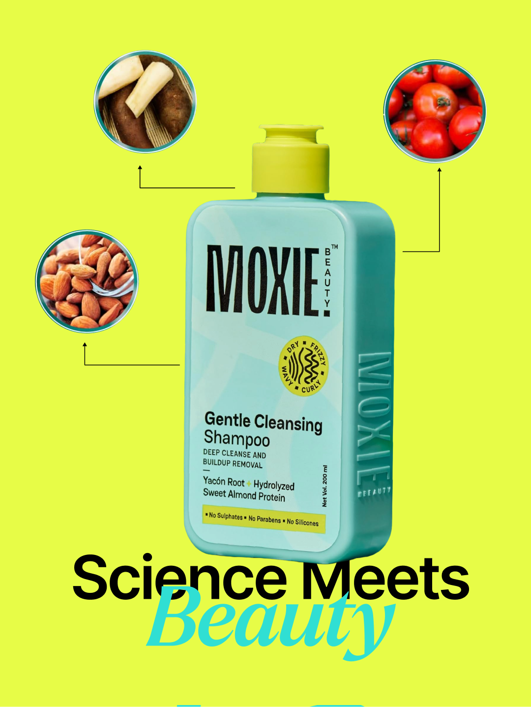
2,481 likes
sid.design Science meets beauty: every ingredient gets credited, not just claimed.
sid.design···
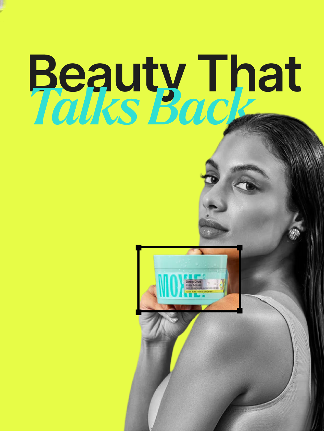
2,481 likes
sid.design Beauty that talks back, and keeps talking after the scroll. 💬
sid.design···
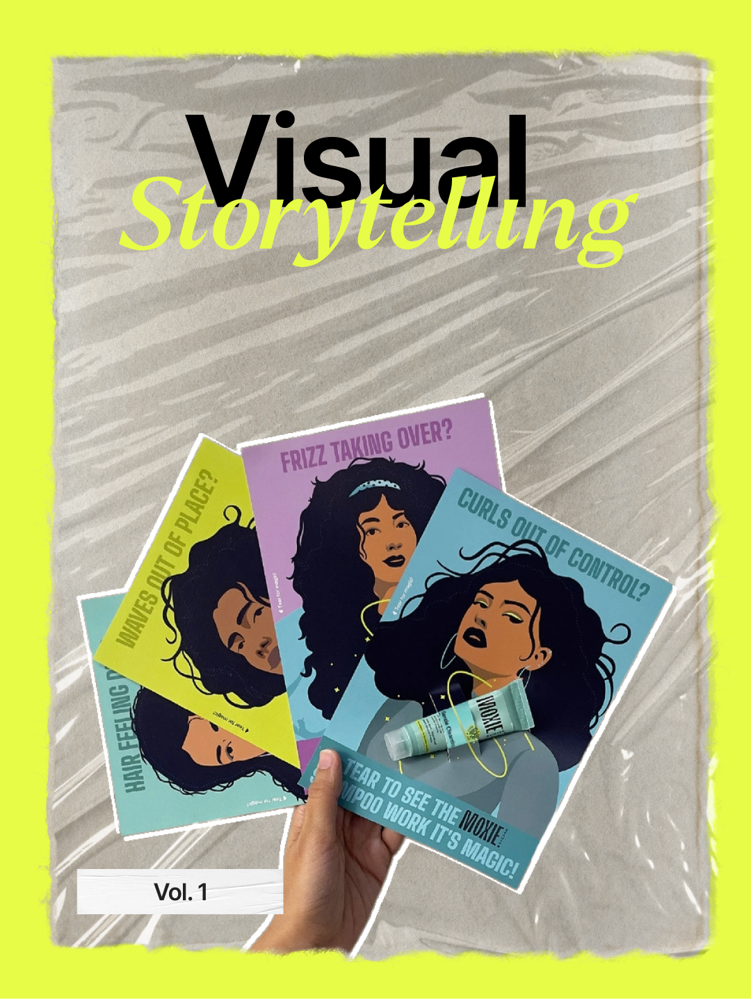
2,481 likes
sid.design Visual Storytelling, Vol. 1: the brand, printed and held. 📌