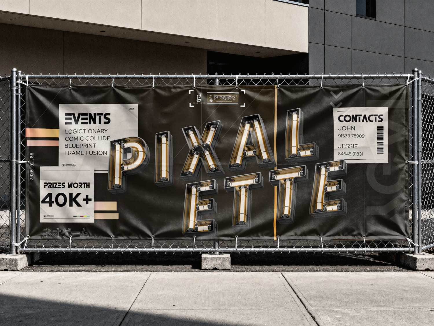
A retro-futuristic type that behaves like a physical object instead of a font choice.
Pixalette
2026
3D render, layout, info cards
Solo
49Instagram likes
- One file served the feed announcement and a large-format OOH banner, at two scales three orders of magnitude apart
- Amber over the genre-default cyan and magenta, so the poster belongs to Pixalette rather than to retro-futurism in general
- Dates and contacts stayed inside the artwork as torn-paper cards, so the organisers never needed a second, plainer info graphic
Ran as the announcement art for Pixalette, the Pragyan ’26 designathon run with Graphique, and was produced as large-format OOH.
Key art for Pixalette, a designathon run by Pragyan in collaboration with Graphique, built around a retro-futurism theme.
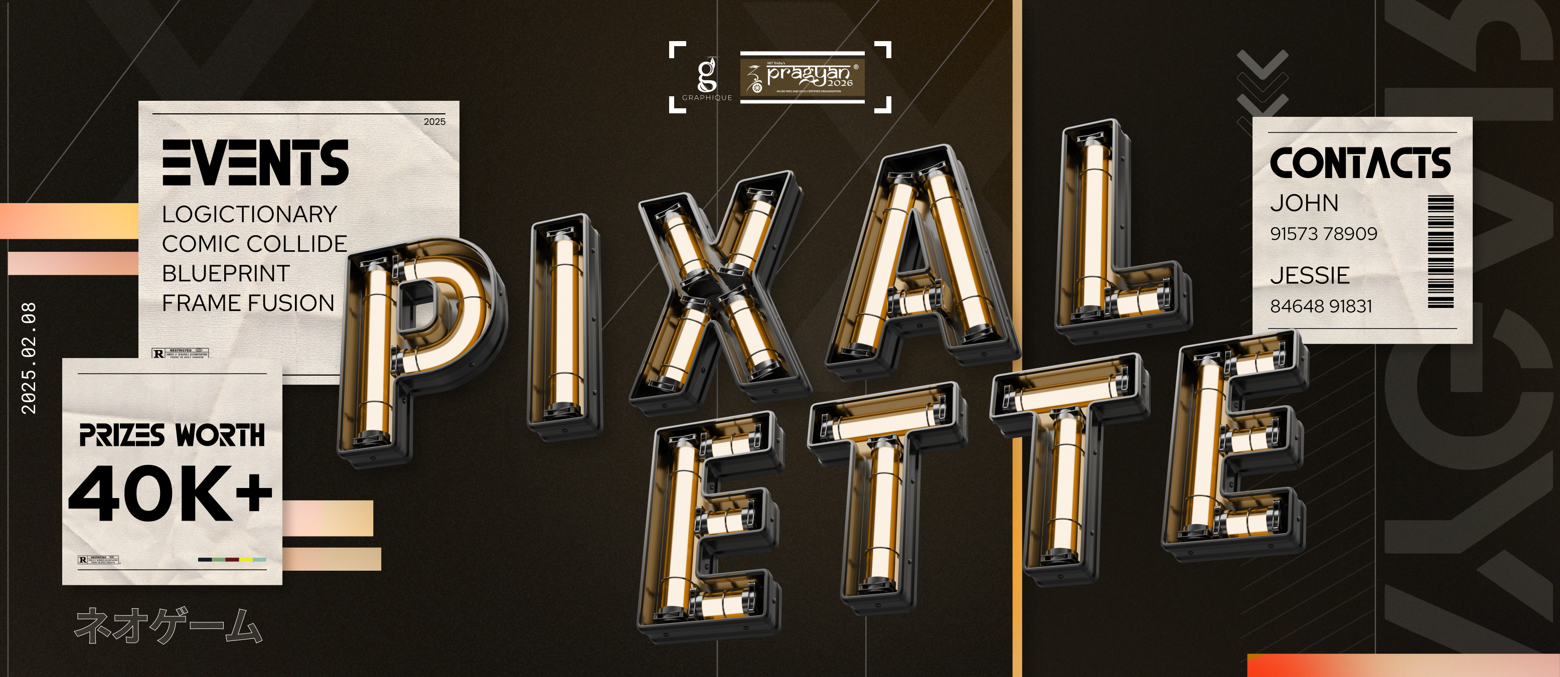
Make the name feel like an actual place you could walk into. Which meant the type had to stop behaving like type and start behaving like an object with real weight, angle, and its own light source.
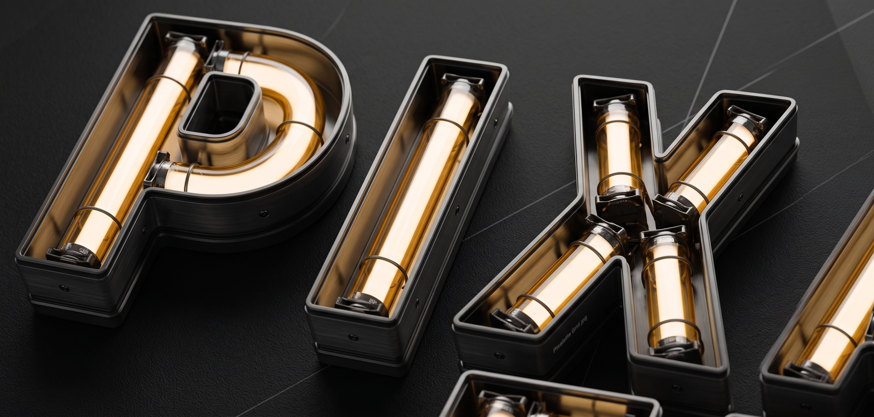
Every letter is an a lit neon tube, because the type needed to be seen as futuristic, with hints of retro, not just survive a screenshot.
- Modelled as physical neon tubes, lit like an arcade cabinet. Every letter had to survive being seen from an angle with real shadow falloff, which is a far harder problem than dropping a glow filter on flat text.
- Each letter is rendered from a slightly different angle across the layout, so the whole sign reads as one continuous space rather than a flat logo copy-pasted at different sizes.
- Amber, against the blue-and-pink combination every gaming poster reaches for by default. It’s the riskiest call in the whole piece, and it’s the reason this reads as its own place rather than genre wallpaper.
- Torn-paper cards carry the event list and contacts, so the practical content reads like flyers pinned to a board rather than a slide pulled straight out of a deck.
What I chose, what it cost, what changed.
Brought a modelled look to the letters so that it does not look like flat text.
- A flat neon effect ends up looking like a font choice. A modelled tube looks like a place, and the brief was genuinely asking for a place.
- It cost a lot of time. Every single letterform effectively became its own lighting problem to solve.
- Key art, not just a poster wearing a good-looking font.
Amber over the genre-default blue and pink.
- The default palette in almost any category is usually the first thing worth cutting. It’s what makes work read as generic genre wallpaper.
- Amber doesn’t scream “retro-futurism” the instant way cyan and magenta would, so some instant genre recognition gets left on the table.
- A poster that ends up belonging to itself rather than to its category.
Gave every letter its own camera angle.
- Identical angles across every letter would have exposed them as obvious copies. Varying them gets the viewer to read one continuous sign instead.
- A couple of letters end up sitting at a slightly harder angle to read than I’d ideally want.
- A wordmark that occupies real space instead of just sitting flat on top of the layout.
Torn-paper info cards for all the practical content.
- Dates and contacts still need to be legible, but they shouldn’t arrive looking like a corporate deck accidentally landed in the middle of the artwork.
- The event details end up looking scrappier than a sponsor might normally expect from this kind of information.
- Required information that reads as part of the world instead of an interruption to it.
The goal, basically, was to make the name feel like a place you could walk into, so the type had to stop behaving like type. Modelling the letters as lit neon tubes instead of applying a neon effect to flat text meant every letterform had to survive being seen from an angle, with real shadow falloff, which is a much harder constraint than picking a glow filter and calling it done. That’s also the reason this reads as key art instead of a poster wearing a cool font.